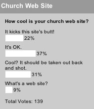
 Last week’s poll asked how cool your church web site is. The results can only confirm the common perception that the church just isn’t very cool. 22% were proud enough of their church web sites to say they were better than this site. That may not be saying much, depending on what you think of this site, but it at least says those are sites worth bragging about. The vast majority of churches—78%—don’t have bragging rights.
40% need to hit the drawing board, with 9% that don’t even have a web site and 31% who thought their church web site needed a mercy killing.
37% responded with the equivalent of a “meh”: It’s OK. Sadly that’s where a lot of church web sites are (though mercy killings are getting close). It’s not good, but it’s not bad either: it’s right in the middle. Sounds vaguely familiar. And not in a good way.
Be sure to check out this week’s poll asking if your church has a brand.


Frank Johnson
September 12, 2005
I’m not sure if it’s all that important to me how cool a church’s website is (which I suspect has more to do with graphical appearance and bells and whistles for most people who respond). The more important question is how effectively is a church using their website.
Just my opinion.
:: cawleyblog ::
September 12, 2005
Church Reviews Dot Org Launches
Drew and company have launched Church Reviews– a site that plans to aid people in finding like-minded communities by enabling people to post comments, reviews, and other observations about the churches they’ve attended. Bravo Drew– I hope that people
Brian Behm
September 12, 2005
I know I answered “ok” wrt our website mostly because I think this one is well designed and fairly cool. Since “it’s OK” is the next step down, I figured that should be my selection. Of course, I actually think our church site is kinda cool, but I might be biased.
glenn
September 12, 2005
Our church website is not the greatest to say the least. In the course of a year we are definitely going to upgrade.
I feel that it is very important to have an above-average site; and in our church’s case, this is true for a couple of reasons:
1. We are a Baptist church with a conservative constituency. I have the belief, though, that a church (and it’s image) can be both conservative AND cool. It’s not mandatory to sacrifice one for the other. I would like our church to have a website that could capture that spirit.
2. The younger demographic will definitely be more attracted to an above-average website. I’m in my late 20s myself, and I know that I personally judge a lot of ministries and organizations by the first impression I get from their websites. If the site is cheesy, low budget, and uncreative, then I presume that much about their ministry (I know, highly unfair, right?) If the site is clean, interactive, and creative, that’s the impression I receive.
I am interested in learning of any group that does above-average Christian website design. I think it would be cool to have a flash splash page and some interactive flash stuff going on in the main site, as well.
Michael Rew
September 12, 2005
You needed another option: My church’s Web site is cooler than my church is.
tony morgan | one of the simply strategic guys
September 24, 2005
Viral Marketing, Virile Thinking, the Sox
I know I’ve been on the sidelines for a bit. I’ve been saving up some thoughts and questions, though, over the last couple of weeks. When I’ve had a moment to let my brain go, here’s what’s been on my
Timothy Fish
January 23, 2007
Whether cool or not so cool there is now a book available that focuses on the things that are needed for a church website. The book is called Church Website Design: A Step By Step Approach.