This 8.5″x11″ neon yellow flier (I know the color didn’t scan that well—I’m a writer, not a Photoshop expert) advertises Jehovah Lutheran Church in St. Paul, Minn.
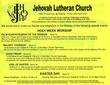
Obviously there’s not a lot of design happening here which really hurts the effectiveness of such a flier. You can’t expect people to read this much text without some sort of incentive—and here the only incentive is interest in this church.
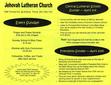
I also found the use of acronyms on the second page annoying—what’s CSP? The flier mentions Jehovah Lutheran Church, Central Lutheran School, and Concordia University—none of which fit CSP. Don’t use insider lingo when trying to reach outsiders.
Being at least a little bit familiar with this church, I’m also disappointed they didn’t advertise their Hmong-language service, considering the high Hmong population in the area. (Though it’s possible they’ve discontinued this service or it’s part of an unaffiliated group—I didn’t seen anything on their web site about it).
The one thing I do appreciate about this flier is how it came. It showed up with my free neighborhood newspaper, the Midway Como Monitor, along with the Midway Chamber of Commerce directory and a few other similar fliers (one for a realtor and one for a community garden show). This is very local advertising, which is exactly what a church should be doing. Jehovah Lutheran Church also took advantage of a special ad placement with this flyer that I would guess would give them more exposure than a simple ad in the community paper.
So nice use of medium, but poor execution.


brand1m
March 15, 2005
There is an incredible amount of type on this card. I realize that many want to cram as much as possible onto a print piece, but less really is more. Its hard to digest so much content in a small space. It would also be nice if it was a little more fun.
At least they are sending it to their local area though. Its amazing how many small neighborhood newspapers exist and their ad space is usually cheap. I have designed a couple of ads for my church that they run in a small local newspaper where they could take out a full page ad for next to nothing. True, it doesn’t have the sexiness of an ad in a large publication, but it certainly hits the people most likely to visit your church.