In our web-focused culture, the 404 error page needs little introduction. If you’ve spent any time on the Internet, you’ve eventually stumbled across a few.
But how many of us actually know what they’re for?
Some 404 Background
Rather than launching into a lengthy dissertation on the history of website error pages, I’ll let this short, informative and hilarious TED Talk do the job for me.
Broken Relationships
I love how the video compares 404 error pages to “a broken relationship.” It’s the truth, isn’t it?
Most error pages happen when we leave broken hyperlinks lying around our websites. Just as with real relationships, errors happen when we miscommunicate and aren’t on the same page.
Just as guests wander and get lost in a church building with poor signage, users can be led astray on a poorly maintained website. If we don’t help them find their way back, they may leave all together.
Examples of 404 Error Pages
Not all 404 pages are created equal. Bad 404 error pages are nearly as common as the errors themselves.
However, many churches have done an excellent job of catching users who fall between the cracks.
Below are 11 examples of good 404 pages that can teach us all some lessons on how to keep our website guests from getting lost and frustrated.
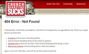
1. Church Marketing Sucks
Why not begin with a website we all know and love—this one. To be fair, it’s not the most creative example out there, but it does cover the basics.
Be sure that the branding of your 404 error page matches that of the rest of your site. Give a brief explanation of why users probably got there.
Most importantly, give them a way to get back out—we’ve provided some helpful links to assist people.
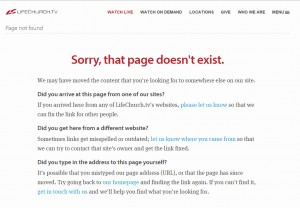
2. Life Church
Life Church in Oklahoma takes a similar approach with their 404 page. They give several reasons as to why the error may have happened and a few solutions on how to fix it.
It’s clean and simple, but effective—just like the design for the rest of their website. They’ve also got several useful links mixed into the text.
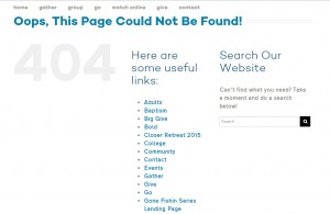
3. North Star Church
North Star Church in Kennesaw, Ga., provides a whole list of links and, better yet, a search bar to assist in escaping the error page.
Many websites also tend to display a giant stylized 404, as shown here. This just goes to show how well-known the 404 error has become. But don’t always assume that every one knows what it means.
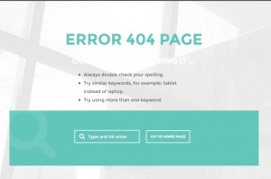
4. Piedmont Chapel
In keeping with the same idea, Piedmont Chapel in Greensboro, N.C., includes a search bar and home button on their 404 error page.
Notice that they also provide some pointers for how to avoid landing on the page again in the future. This page also does a good job of keeping with the simple elegance displayed on the rest of the site.
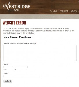
5. West Ridge Church
West Ridge Church in Dallas, Ga., takes the 404 page to the next level. Not only do they provide an explanation for the error, their page invites feedback from users in the form of an online form.
This makes the experience more personal and helps to prevent it from happening again in the future. This also gives the church staff another chance to interact with users.
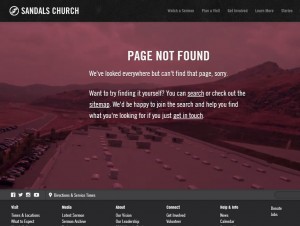
6. Sandals Church
We all know how important visual elements are online. The 404 error page on Sandals Church’s website in Riverside, Calif., shows how to incorporate visuals into the 404 page.
Although you can’t see it in the screenshot, the background of the error page is a video showing the church’s campus.
In fact, the video seems to play into the idea of looking around for a missing page. That may be a stretch, but it has a cool effect.
7. Hillsong Church
Here’s another great example of a visually rich 404 error page from Hillsong Church in Sydney, Australia.
There aren’t many links or much text explanation — but there is a beautiful, full-screen image of the beach. Something tells me that this is one error page that most users won’t mind stumbling across.
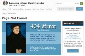
8. Evangelical Lutheran Church in America
This website may be a bit more traditional than some of the others we’ve seen, but it’s nevertheless effective.
Evangelical Lutheran Church’s website introduces some humor into their 404 page by quoting Martin Luther and then giving a tongue-in-cheek comment about the Protestant reformer.
While a little cheesy, this approach is a good way to pay homage to the church’s traditions and still be relevant in the digital age.
9. Elmbrook Church
Much like the last example, Elmbrook Church in Brookfield, Wis., chooses to inject some church humor into their 404 error page.
Instead of Martin Luther, they refer to a passage about lost sheep, as found in the Gospel of Luke. Adding the comical image of the sheep helps to keep the tone light and playful.
Unfortunately, the last of the three links on the page is still broken. That’s just a reminder to vigilantly check your links and prevent those sheep from getting lost.
10. Elevation Church
Many 404 pages use the word ‘Oops‘ to show that they’re lighthearted and as upset as you are about the error. But how many also include a silly photo of their lead pastor like Elevation Church in Matthews, N.C.?
Adding a photo like this really helps to personalize and humanize the page. It shows that they understand how frustrating the error is and that they want to help.
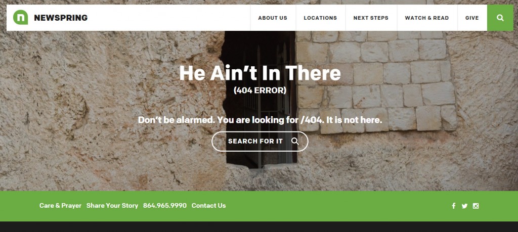
11. Newspring Church
Finally, Newspring Church in South Carolina provides us with another example that is both lighthearted and visually appealing.
Their error page obviously references the empty tomb of Christ. But it does so with a few words and a very crisp and clear image. The tone of the text is very informal and still personal.
What Have We Learned?
- 404 error pages are everywhere online.
- They aren’t all bad.
- Some do a great job of connecting users back into the website experience.
- Feature visual elements in keeping with your site’s brand.
- Include links and/or a search bar to guide user back out of the error page.
- Add some humor, if you’re up for it.
- Also, in researching this article, I discovered that it can be quite enjoyable deliberately causing 404 error pages on websites. Try it for yourself sometime.
How to Make Your Own
Instead of getting into all of the technical details, I’ll simply point you to some other resources around the web that will teach you how to create your own beautiful, functional 404 error page:
Photo by brionv.





Eric Dye
October 14, 2015
These are great. :D
Dale
November 17, 2015
WordPress & other systems also have plugins that will use the link text as a search term and try to guess what you’re looking for and send you there. Search for “Smart 404” or something like that.
NB
February 2, 2017
Here’s another one: https://holyfamilyparish.org/abcdef