 We got an e-mail the other day about a fun church marketing story. Ryan Haack is involved in planting a new church in Madison, Wisc., the Journey, which will open its doors December 5.
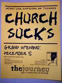
They began plastering the community with promotional flyers (see photo inset for full view) with small lettering across the top that said, “Without love, compassion and tolerance,” and then in huge letters: “Church Sucks.”
The response came the same day with a call and an e-mail from a local professor, complaining that if they were really Christians they’d take the signs down, according to Ryan. The professor threatened to file a formal complaint and alert the local paper, though commented that more attention is probably what they wanted.
“Uh yeah,” Ryan wrote in his email. “That’s what a flyer is supposed to do, right? Get attention?”
We haven’t received any independent confirmation of the story, so it’s best to keep an open mind, but the scenario itself is worth considering.
Ryan and his fellow church planters seem to be trying to launch a church that can reach out to a different demographic, one that’s not likely to be enthralled with church. As such, they’re trying to get their attention with a flyer that seems to say that church sucks. On closer examination, the flyer is instead rejecting forms of church that lack love, compassion and tolerance. The message is clear: those forms of church suck, we want something more.
It seems like a good message, a practical example of an earlier discussion on this site about T-shirts with a similar message. It’s certainly bound to offend some people, particularly those like the local professor who maybe don’t understand the attempt to reach out to those who dislike the church.
I particularly like the acknowledgement from this group that church isn’t perfect. If it’s not done right (and let’s face it, we can’t ever manage to get it right) it sucks. It brings me back to my favorite refrain, that we’re a broken people and we make for a broken church.
At the same time, it’s important to be clear what you’re saying. The message is not that church sucks. Perhaps the rest of the flyer should have been more affirming of that message, I don’t know. Brad Abare said the other day that we didn’t call this site Church Sucks because that’s not what we believe. As broken as the church is, and as much as it can suck as I just said in the last paragraph, the church is also how God has chosen to work in this age, and as such it definitely doesn’t suck.
I would hope a flyer like this would draw people in to discover a church that doesn’t suck. It may offend a few church faithful, and hopefully that can be avoided and mitigated if it happens, but if it brings people to Jesus, more power to them.


Ryan D. Haack
November 23, 2004
Kevin,
Thanks for your response. Our message is just as you said, that essentially church without Christ does suck. Of course we don’t think “the Church” sucks as that is what Christ has called us. We are the church. One of our main concerns is that when churches “grow” these days, it’s almost always because people come from other churches because they heard the worship is awesome or the speaking is incredible. It’s almost never non-churched people.
Those are the people we’re after.
A neighborhood zoning comittee member said it best the other day. When I asked him what he thought about our flyers he said, “It’s to get attention, right? You could have written SEX really big and offended a whole lot more people.” He got it. He wasn’t missing the message because of a word.
We also do understand the sensitivity to language usage and took that into consideration. Sucks is a powerful and offensive word. Church without love, compassion, and tolerance is also offensive and we wanted to convey that in a powerful way.
A reporter from a Madison paper attended our service this last Sunday and will be writing an article about what we’re doing by the end of the month, so I’ll try to post that when it’s available.
Trying to let the Gospel offend people and stay out of the way,
Ryan Haack
Faith Creative
June 20, 2005
Postcard / Flyer Ideas
Here are a few different paper marketing ideas that stand out from the traditional sunrises and grassy fields.
Church Sucks Flyer
Mary Christmas Card
Easter Cards
…
Kevin McGuire
November 18, 2005
Wow!
I developed a flyer title “Church Sucks” over a year before you did!
I got the idea because I interviewed many youth in the community who had that response. My church mailed out about a thousand of the flyers. We got a couple negative responses by christians in the area, although our flyer stating exactly what yours did.
Unfortunately some of the leadership of our church got cold feet, and didn’t sustain or follow up on this ministry!
Kevin
giovanny
June 7, 2006
how can you not fall into a routine with christianity?
eric
September 16, 2008
i don’t understand what u guys are trying to do ..
Church Flyers
April 14, 2009
I absolutely LOVE that flyer! That is what advertising is all about. Sometimes there is a bit of shock value that grabs the attention of the viewer to make a point. I asked my wife about how she felt in regards to this flyer. She admitted that it was a little bit on edge for her. But if you think of it… Jesus was full of shock value! Imagine when He said you have to eat my flesh and drink my blood! What an offencive statement. Then just think that He said that to a group of people who wouldn’t even eat pork!
Bethany
June 18, 2009
At first, I was like, NO WAY!!! Then, as I read further, I was like, RIGHT ON!!!! It really got my attention and it made me realize that its true! Church really does suck with out love and all that wonderful stuff! I’m glad that I belong to a church that is in the process of becoming “LOVELY”!
Dane
January 7, 2014
We are launching a Church on 2nd Feb 2014 here in cape town, South Africa. I was looking for flyer ideas, as our budget is limited and need something to go “viral”. So we decided to use the “Church Sucks” idea with its slogan too. I am quit exited about this idea. Thanks again. Blessings…