Our Courageous Storytellers Membership Site is exploring design this month. We’re offering resources for design beginners, folks who struggle with Photoshop and can never remember what a serif is. But on Church Marketing Sucks we wanted to go deeper and talk with some professional graphic designers about design in the church.
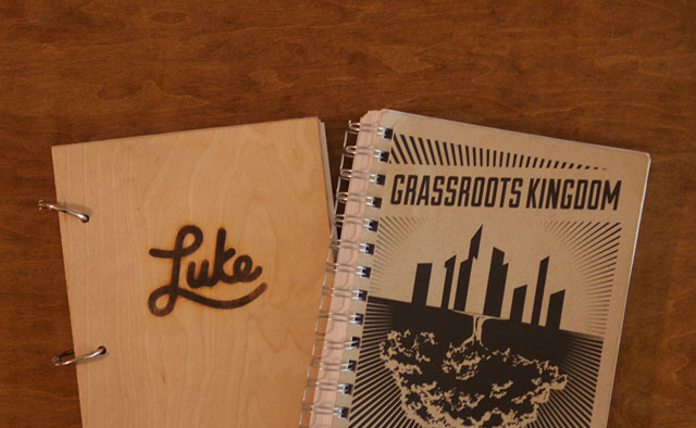
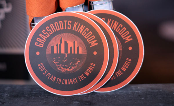
First up is Marcus Williamson. He designs stuff at the University of Tennessee (his words; his official title is senior graphic designer). He also helps out at City Church in Knoxville, Tenn., and did the residency program at Midtown Fellowship in Columbia, S.C. Marcus has also done freelance work for various churches and for the North American Mission Board’s Send Network.
You can take a look at Marcus’ work on Behance and Dribble.
It seems as though the church is often lagging behind the culture when it comes to creativity and design. Why do you think that is?
I think the church enjoys the idea of embracing design of some kind, and it has come a long way honestly, but like you said, overall it’s still lagging. I think some of that is churches just need to continue putting more resources into creativity and design. Even if that’s a 10% increase for churches, it would be a start. Finding people who are creative in your church family and allowing them the opportunity to grow and make mistakes while also pushing them to look at inspiration outside the church is something that would be helpful.
When it comes to visual communication, what is the church doing right?
I think we are moving toward the things I mentioned above, but continuing to move in that direction will be the fun part. So we are putting more resources into design. I see more and more churches starting to understand that this generation is very much a ‘judge a book by the cover’ type generation (I know I am), and they are taking steps to figure out how to best serve that in their area without changing too much of who they are.
I also believe there are more churches looking in-house and asking church family to help with design efforts or any type of creative effort. Which is so cool to see. Again, we just need to keep moving down that road.
How can the church do graphic design better? Do you have practical suggestions for how churches can improve?
Figure out how to get designers and creatives to participate in your communication efforts. So whether that’s in-house or through a freelancer, I think having someone who has a good eye for design will only help your church impact your community.
But having someone with a good eye for design doesn’t necessarily get you to where you want to go. I think once you have that person or team of people, then figure out how to have creative meetings with them. Doesn’t have to be super involved other than going over where you’re wanting to go with sermons, children and student stuff, and other ministries that you have.
A word of advice: Don’t overuse your creative(s). The goal for your creative is not to fix all your creative problems, especially if this is your first time with a creative. I’d say their first goal is to help establish some creative foundation. Start slow and then build from there. Figure out a style you and your creative think is wise to go in and then figure out how to implement that throughout your church over the course of a few years. Don’t rush the process. Also if you’re creative is a college student or someone that will only last a year figure out how to train up someone alongside that person so they are ready to take the reigns or at least figure out how to leave solid instructions for future creatives.
What tips do you have for designers and creative people at churches who want to step up their design game?
Keep looking outside your immediate surroundings for inspiration. I think a lot of church creatives can get caught in the cycle of looking only at church creatives or looking only at what’s around them for inspiration, or even just coming up with stuff that’s in their head without looking at any inspiration. I know I’m guilty of that.
The best thing I’ve done to try to help with that—and I credit Kent Bateman, who was the communications pastor at Midtown Fellowship, for helping with this—is to start a Pinterest board of designs. So for every series, graphic, etc. I create a board of inspiration and I look to Dribbble, Behance, and other sites for inspiration. After I get a few directions, I ask Kent, who is now helping plant a church in Knoxville, Tenn., to see what he likes direction-wise, and we go from there.
There are also other things I would say to step up your game:
- Keep creating. The more you do the more you’ll find a groove.
- Allow others to speak into your designs, but don’t let everyone speak into it. It’s easy to become so focused that you miss certain things about what you design so having someone you trust to give you a solid critique will help.
Where do you find the inspiration that fuels your creativity?
Dribbble and Behance are my go-to’s. With Pinterest being a “look at similar things you’ve pinned” type thing. A few designers and companies that I really like currently, in no particular order:
- Nick Slater
- Jay Fletcher
- The Half & Half
- Ryan Hollingsworth
- Fuzzco
- Steve Wolf
- Ryan Putnam
- Tyler Anthony
All of them have various styles and I love that.

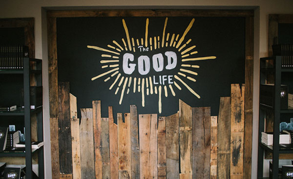
“The Good Life” was the 2013 fall campaign for Midtown Fellowship and includes a font Williamson created, which you can download for free.


