
Graphic design is not art. Not in the traditional sense at least. It has much more to do with function than form. Don’t get me wrong—beauty matters!
Beauty is at the heart of God and is clearly and uniquely expressed in his creation, from the diversity of the nations to the natural world we experience with our senses. I’ll say it again: beauty matters. Design, however, is not about beauty. It’s about visual communication.
Visual Communication, Not Beauty for Beauty’s Sake
As designers we are visual communicators. As we grow into this truth, we should seek to understand why we communicate. Admittedly, it’s a hard truth to grasp. I’ve certainly taken my lumps as a young designer.
I, like other designers, want to create beautiful work. We desire to create work that resonates with the audience, evokes emotion, motivates people to get behind the work and proudly represent it. More than anything, we aim to create content that invites and inspires people into a deeper and intimate relationship with Jesus and their neighbors. In our pursuit of these things, though, we can neglect the very audience we are communicating to.
Here’s what I mean. I serve the Transformation Church, a multi-ethnic, multi-generational church body. It is a beautiful family, and I feel honored to serve it. My church family is a foretaste of heaven. However, it is not without challenges.
How do you create something that resonates with a millennial and baby boomer? What resonates with a man from southern India and a white woman from Montana?
Generations and cultures vary. They think differently, reason differently, hold different values. It’s a nuanced challenge, and I’m sure I am not the only one called to such a task. I’ve wrapped my brain around the question for years now, and it’s led me to a conclusion: Design must be accessible to its intended audience.
Accessible Design in Action
It’s imperative that design can be easily digested. But how does one resonate with something they don’t understand? Being that we are visual in nature, let’s take a look at some examples.
This first example is a piece that I designed for a membership class. It didn’t work. In fact, it never left my computer. Why? Because it’s not accessible.
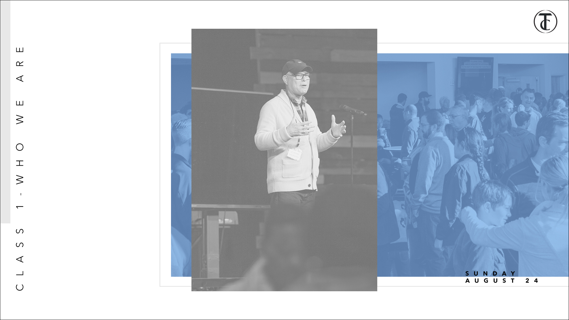
Does it look cool? Sure! I’m completely and totally biased, though. The work has problems. It’s hard to read and lacks clarity. Similar information isn’t grouped together, making it take a while to digest.
It lends itself much more to the art world, which isn’t good in this instance. The piece holds—or is supposed to—important information that the majority of the church needs to know. It needs to be understandable at a glance. The overarching message should come through loud and clear, inviting people to take a closer look and learn more.
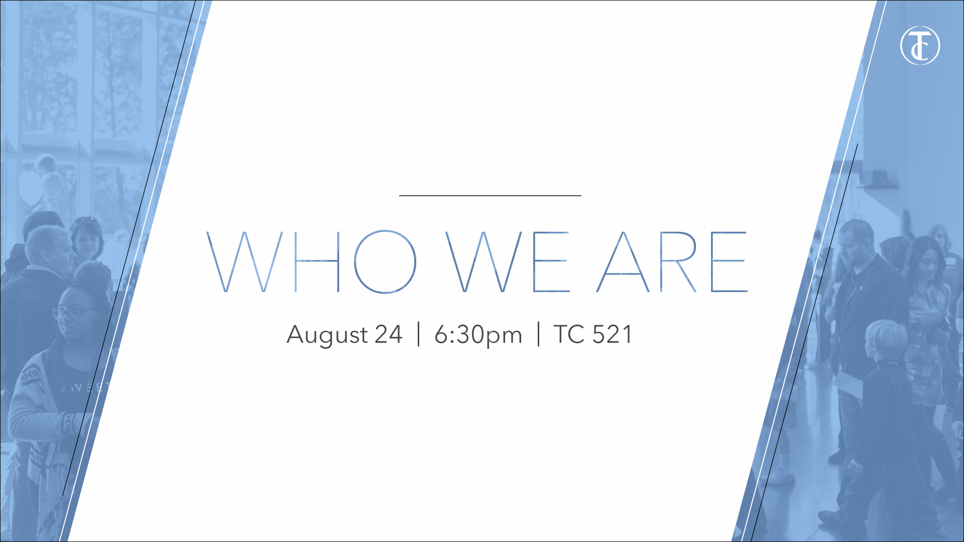
The second example works. Notice its simplicity. It holds similarities stylistically, but the message never gets lost. Like information is grouped together, and it doesn’t take long to digest the content. It remains simple and clear while still being an attractive piece of consumable content.
The graphics below worked from the get-go. Because they were designed for my church’s Teens and Internship ministries, I could take more creative risks. It was totally OK to take liberties with the typography, trippy “all of life” and disconnected “history.”
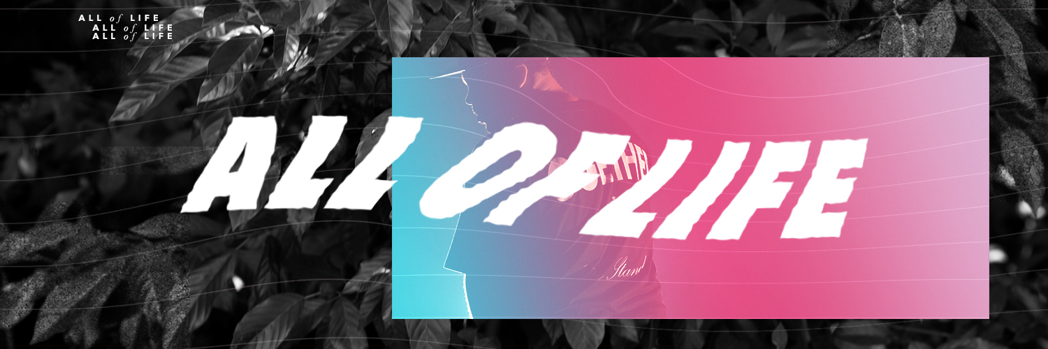

However, the pieces would not have worked if they were meant to have a high impact across the church, i.e., 80 percent or more of the congregation. High school students and young adults take in information differently than their parents, so the work’s accessible to them. Undoubtedly, their parents and grandparents would struggle more to grasp the meaning.
3 Lessons to Remember
Again, these are lessons that I am actively learning. Lessons I am trying to exercise moving forward.
- Remember your audience. It is so important to know who you are communicating to. Seek to understand them. Ask questions. Study how they take in information.
- Make it accessible. It’s simple. If your audience doesn’t understand the content, it isn’t effective, no matter how “cool” it looks. One thing I find helpful is to ask different people on staff if they “get it.” This gives me a pulse on whether I’m communicating well to the diversity within our church body.
- Stay principled. Don’t forget design principles. They are principles for a reason! Contrast, repetition, alignment, proximity, color, type, space—they all matter and are extremely important in creating coherent pieces.
I want to encourage you to be relevant, but be relevant to your congregation! It is your congregation that you love and serve. You have the amazing calling to inform and inspire your church family and community!
So serve them well. Be intentional in your visual communication. Give them tangible and accessible handlebars to grab on to, to love God completely, to love themselves correctly, and to love others compassionately.
I’ll conclude with this: our God is a designer, and he designed you with talents and gifts. Cover them with prayer and intentionally use them for his glory. I promise, you’ll be amazed at what he does through you and the work of your hands.
Juhan Sonin (Creative Commons)


