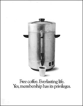
While reading Graphic Design and Religion, I came across the Episcopal Ad Project of 1979. Apparently, Reverend Dr. George H. Martin decided he wanted to venture into advertising, which churches hadn’t done much of before. The ads were a work in progress for six years with Fallon McElligott Rice of Minneapolis, and they looked to use contemporary language and ideas to communicate God.
The entire project (which is still being worked on) became the Church Ad Project, and is now available online to order the prints in many different formats. For the quickest browsing, check out their posters. (Editor’s Note: Church Marketing Sucks does not endorse web design with so many font colors and “click here” links on the aforelinked site.)


Kyle
May 23, 2008
I saw that exact poster at Westwood Cheviot CoC in Cincinnati (the church is over 100 years old) I thought it was the most clever church tag line ever!
I’m glad to know where it came from.
K
Matt Huber
May 23, 2008
That is an amazing poster. Being one who grew up in the church, a lot of these make complete sense to me, and are quite hilarious.
I love the “Original Powerbook” one…hehe piggybacking off of the success of Apple.
Katharine
October 1, 2013
I just tried the link–looks as if the domain is up for sale. Too bad. I’ve been counting on using their ads again when I had more budget for print advertising.