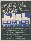
 This ad for Corner Church in Minneapolis appeared in a recent issue of The City Pages, an alternative newsweekly in the Twin Cities. A church ad proclaiming that church advertising sucks? I don’t get it.
It doesn’t help that the type style for the slogan “Church advertising sucks” looks pretty familiar, but I can’t quite place it.


Jennifer Torres (jenevive)
May 2, 2006
Well, I guess you can be flattered. I don’t quite understand the purpose either, other than that the word ‘sucks’ can get some attention when it’s on a church flyer.
RC of strangeculture
May 2, 2006
That’s really interesting…maybe there just trying to say God exceeds the expectations of what can be put in an advertisement…
they had to know about this site.
–RC of strangeculture.blogspot.com
Steve
May 2, 2006
And someone needs to teach them that if you re-size your photos in FrontPage that doesn’t really re-size the image on your website. It takes a huge image, and loads it like a huge image, but just shows it small.
As for the ad, I think they’re trying to say “church advertising sucks, but God exceeds our expectations.” But in execution, it doesn’t quite work. It’s like saying “this is a lousy ad for a church but God’s not lousy, but we’re so hip that we can be self-effacing in our ad. See, we’re so cool we’re comfortable making fun of ourselves because we’re not some stuffy old church”
But there are other ways to do that, that would probably be more effective. I appreciate the sentiment they’re trying to express, they just need a different plan of attack to communicate it.
Jeremy Scheller
May 2, 2006
So I’m trying to take a quick glance at their website and decide who their target market is. Living in Minneapolis and actually having been somewhat of a regular at two of the coffeeshops this church meets in, it seems like their target market would be the 20-30 something loft living, downtown working, scenester/techie.
Their website/identity could use a total overhaul if they’re really looking to meet that crowd.
I think the concept of the church is great and the potential to meet people who are living the downtown lifestyle is huge, but demographically, you have to wonder who those people are. My guess is that this would be the place to implement some of the values, ideas, and apps of Web 2.0 recently discussed here. Adherance to one of the main principles (Design Matters) being a foremost concern. They also look like they’re just getting going, so who konws where it will go…
I’m not sure that ad is the best way to promote though.
john
May 3, 2006
it’s just as stupid as your name.
kevin
May 3, 2006
john: LOL
Jeremy & Steve: I didn’t intend for this to be critique session, but if you’ve just got to get your church design critique out there, head over to the Church Marketing Lab. There’s tons of folks just waiting for some good comments.
hale-yeah!
May 3, 2006
way to be original!
Jeremy Scheller
May 3, 2006
Just can’t resist.
I’ve been told being critical is what I do best.
(not loving my neighbor or even my own design)
Karen O'Neal
May 3, 2006
I’m not quite sure what they are trying to get across either. I also don’t like that they used your logo, but changed “Marketing” to “Advertising”. Why is it that churches think they can copy other logos and identities? If we expect companies to follow the copyright laws, shouldn’t we expect the same for churches?
Brandon Meek
May 3, 2006
Sometimes, I look at something and I think to myself, “How, or why, did they think this is good?” I would love to be there for that meeting, “Ok, showing something about our church is cool and all, but what we REALLY need is to say that church advertising sucks. Then, people will want to come because, well, church advertising sucks.”
They were spot on if they were describing their ad though.
Gene Mason
May 3, 2006
Well, imitation is said to be the sincerest form of flattery. But in this case…
Scott From Igniter
May 4, 2006
Blatantly stealing sucks.
strugglefish
May 5, 2006
Has anyone emailed them and asked? Surely there is a reason. I understand the reason for this site, but I’m not to keen on the use of “sucks” in any advertising except maybe a vaccum cleaner ad or something related to, well sucking. Maybe its a good time for that name change?
Chris Robinson
November 3, 2007
I think the problem is the the box around “Church advertising sucks.” Upon reading it a few times i think they mean “Church advertising sucks but God exceeds expectations.”
When I first read it I thought that was just their little slogan and the had slapped church marketing sucks on the front of it. Confusing.