
Your brand is much more than your church name, logo or some catchy slogan. Your brand is the all-encompassing personality of your organization. The more you can define and refine your brand, the easier it is to create cohesive, effective design.
Every organization has a brand—although most of the time it has not been explicitly defined. As a designer, this is an opportunity to improve the entire visual look of your organization. By defining some simple and consistent brand rules, your designs will be stronger, more unified and easier to create.
Branding is a vast field with many applications and can sometimes feel overwhelming—we could do an entire series on it. But we’re going to focus on expressing the visual elements of a brand in a simple and consistent way that can be easily understood, recognized and applied.
Your Logo
Chances are many of you reading this already have a logo. For a quick demo, let’s assume this is your logo:

Most logos require a few color variations to ensure the logo can be applied across many mediums. I’d recommend having at least these three: Full color, grayscale and one color.
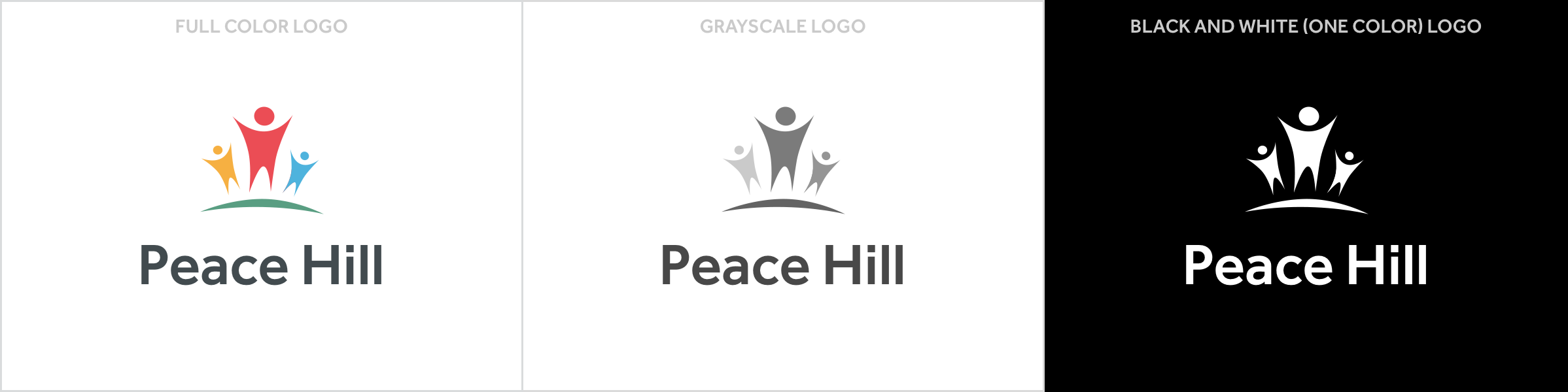
You may also want to have an alternate layout for your logo. But don’t get too carried away here. It’s best to keep it simple and consistent as much as possible.
Try to avoid having too many variations of your logo. As people are exposed to your branding over time, it will become more quickly recognizable—and a recognizable logo is a huge part of good design.
Even if you’re not thrilled with your logo, having some color options and using it consistently will make it work better.
Color
Color is a powerful element of your brand toolbox. You can use color to communicate your brand personality and even evoke certain emotions and feelings in your audience.
Qualities Associated with Colors:
- Black: Strong, Professional, Firm, Masculine, Luxurious
- Red: Excitement, Urgency, Hunger, Passion
- Green: Natural, Youthful, Calm, Wealth
- Blue: Trustworthy, Professional, Powerful, Secure
- Orange: Energetic, Aggressive, Creative
- Yellow: Positive, Innovative, Happy, Youthful
- Purple: Spiritual, Loving, Calm
- Brown: Natural, Safe, Reliable
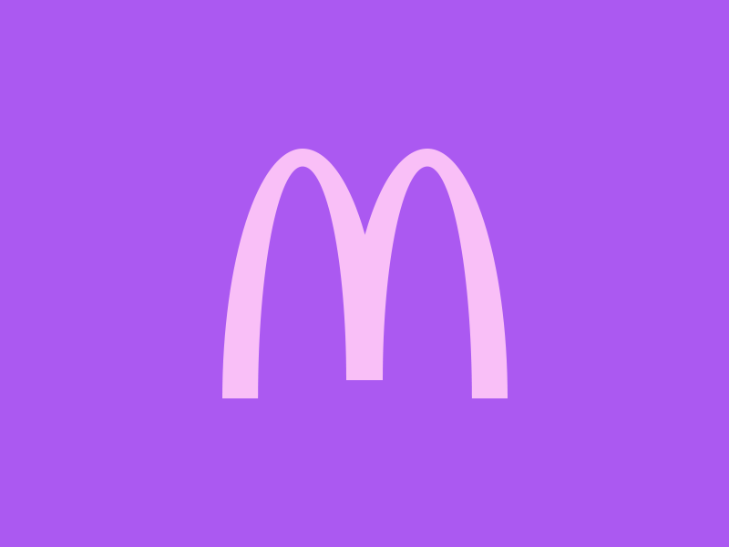
Now consider why many fast-food companies use red and yellow for their brand colors. These colors have been shown to trigger appetite, hunger and happiness. How would things change if McDonalds used pink and purple instead?
What do your colors say about your brand? Whatever colors you decide to use for your brand, make sure you’re consistent. Color is one of the biggest factors in creating a memorable brand identity. Using color consistently across your marketing materials is a good way to bring cohesiveness to your design.
Typography
Type can be used in your design materials to further form your brand identity. Finding a good font is not always easy though. Check out our intro to typography to learn more.
Using too many fonts makes your brand style hazy and hard to identify. A good rule of thumb is to use no more than two fonts. Keep it simple. Pick a font style that works well with your brand, and stick to it.
Much like color, using the same few fonts in all your marketing materials will bring cohesiveness to your designs. You get better, stronger design and it reinforces your brand.
Good Branding Makes for Good Design
Branding can be tough, but if you take a bit of time to think through your brand personality you can choose elements that compliment and distinguish you and help create a memorable visual identity. We’ve touched on your logo, colors and typography—but the same principles can be applied across the many facets of your brand (photography style, video composition, copywriting, etc).
If you keep things simple and consistent you’ll be better equipped to express your brand in a way that is straightforward and memorable. Good branding makes for good design.
More: Check out the rest of our Design Basics series.


Christian
April 7, 2014
Good advice, Vin!
One thing I’d expand on is to encourage people not to feel locked in by the two-font rule. We have a serif body font (Elena by Process Type Foundry) and a sans-serif header font (Bernini Sans by Just Another Foundry) that we use in 90% of applications, but we have a fleet of a dozen or more sidecar fonts, both commercial and free, that we use in alternate contexts. The sidecar fonts are especially useful when making signs or other more creative material—applications where our normal serif and sans-serif pair would feel a bit too stodgy.
I’d also stress that good fonts are worth their investment. Licensing commercial typography can be expensive, and that can be a hard sell to people writing the checks (“you want to spend over $1000 on a font?!”), but for something that’s used in many places every day, those costs amortize well. A good alternative to outright licensing is TypeKit’s desktop font solution, which provides access to a large number of fonts for a reasonable—albeit recurring—fee.
Jim Thompson
February 16, 2015
How important is a church’s name when developing a NEW brand?
Some churches rely on traditional naming, like First Presbyterian of Downers or St. Whatever of Wherever. However, as more non-denominational churches pop up, the importance of selecting the right name cannot be overlooked.
Follow up questions…. What advice would you give to a new non-denominational church that is searching for the right name to attract younger parishioners and their families?
Thanks,
Jim Thompson