We know it’s almost Christmas, but this peer review tackles postcards promoting an Easter art installation. Nothing like working ahead of time. Post your feedback in the comments.
Samples:
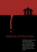
Postcard 1:
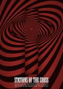
Postcard 2:
Notes:
Urban Seed
Melbourne, Australia
Created by Stu McGregor
A 1-year-old urban church plant with an emergent/alternative edge is promoting an Easter art installation. It’s a small church that draws about 20 people and appeals to people worn out/burnt out on religion. The postcards will be sent to local churches, local cafes and individuals.
The postcards go to print in another week, so there’s a brief window of opportunity to implement feedback. The text on the front of the cards is obviously not finished, and the back of the card will include details of the installation (not ready yet) and some text to expand on the idea, as well as the usual space for postage and address info.
Questions:
- What do you think of the design?
- Will it grab the attention of the intended audience?
- How might you change or improve it?
- The text on the front and back of the card is not finished–any suggestions on how to expand on the idea in the text?


Michael
December 13, 2005
I like both of these quite a bit. They pass the refrigerator test. The postcard would definetly catch my attention, and while it is clearly something related to christianity, in its form right now it doesn’t smell real churchy and fits your audience well.
Do remember to do something great with the other side as well as it could very well be the side they see first.
Well done!
Brandon Meek
December 13, 2005
The first one is great. It looks cool and communicates clearly.
On the trippy one, the body copy is too small.
Both are visually interesting and they don’t use cheesy pictures of smiling families, which is always a bonus in church pieces. :)
s. zeilenga
December 13, 2005
Aside from the fact that I usually only like cheesy pictures of smiling families this design is pretty neat… errr… wait.
Seriously though, the top one is high quality design. I am sure the two tone design will be cheap on the pocketbook and the effect is still stunning. The second one is alright although it does funny things to my eyes. I am not sure if it will get the job done.
All in all, they look good. I think the final copies will be nice attention getters.
Josh
December 13, 2005
Both are very nice pieces. I am more partial to the #1 design. It’s simple. I really like the layout and text placement. Design #2 is just a little too trippy for me. I will say though that it grabbed my attention… on that note, it’s a good piece.
Nice work.
nate klaiber
December 13, 2005
I like the first one better than the second. As others have said, the second one seems to play with my eyes (and become more of a distraction from the message).
The first one is simple and still portrays the message. The picture isnt a distraction, but enhances the message of the text. The white text/typeface is somewhat bland – but the message is still there. Maybe playing with different typefaces, word/letter spacing, etc.
Looks good! I think it will definitely get the job done!
Peace,
Nate
Ben J Walker
December 13, 2005
I think they’re great. It’s great marketing as it puts the actual goods on show, and they themself rock!
Definitely good to see a Church doing something a bit different!
Love it.
David Staples
December 13, 2005
I like them a lot. I especially like the second one. I think it will definitely draw that age group. Very nice job. And I like the 2 color approach. It doesn’t cut the quality while saving money.
Anthony D. Coppedge
December 13, 2005
“The postcards will be sent to local churches, local cafes and individuals.”
Did I understand that they were going to send these to other churces, too? Why?
Stu McGregor
December 13, 2005
“Did I understand that they were going to send these to other churces, too? Why?”
it’s because it’s an art installation that runs over a few days. it’s simply an option for people to reflect on the easter story. down here in the antipodes it seems most people go away for the holidays as it’s the last gasps of the warm weather. so running this at night gives them an opportunity to reflect for an hour on different aspects of the passion.
there’s no sheep stealing going on here! :)
this has worked very successfully at cityside baptist for the last 10 years where the installation has become a treasured feature of the Auckland Christian landscape. Mark who was the pastor there has since moved to
Australia and started this little congregation and thought it would be good to implement a similar event.
thanks for all the comments thus far, very encouraging.
Melissa Moore
December 13, 2005
I think they both have nice design and appeal. However, as a someone who suffers from vertigo, I can’t look at the second one long enough to even begin to read the copy… :0
Steve
December 13, 2005
The color scheme reminds me of U2’s last album, How to Dismantle An Atomic Bomb. And that’s alright with me ;)
Roger
December 14, 2005
I like the first one. The second one I don’t really care for, although the text on the bottom should definitely be bigger.
Dana O
December 14, 2005
The second one looks like it could’ve been an ad for Absolut Vodka — just replace the cross with the Absolut bottle. I guess it’s just the way the viewer has to “discover” the cross in the psychedelic swirl. For me, this ad doesn’t work. 1.) I’m too sure the reasoning behind the use of the swirls and 2.) To tie everything together, especially in the case of this “discovery” type ad, the headline needs to be a home run.
For me, this ad just looks cool, but doesn’t complete the thought — so to speak. I think with some headline reworking, it has potential.
thanks for submitting! :)
Jana
December 14, 2005
While either design could be appropriate for the audience, there’s also the issue of whether it’s appropriate for the event. The tone of the first piece is quiet, even meditative, which is really appropriate for the event. The design of the second piece might be appropriate for, say, an energetic Christian concert, but it doesn’t seem appropriate for this event. And because of that, for me, it seems to come off as trying to be something it’s not.
Keith Locke
December 14, 2005
I love the 2nd one… the 2nd one works. It makes you come back to it over and over even though it is bothersome. It provides healthy tension. First one is good too. But the 2nd one wins with me… even though it messes with me. That is exactly why it wins.
Cool stuff.
Chris VDB
December 17, 2005
While I feel that both of these designs are appealing and eye-catching, the first one is by far my favorite.
It provides the audience not only with something pleasing to the eye, but it also communicates some degree of Christian theology as well. By displaying the cross, along with the blood running down the black, creating – yet filling the gap that prevents us from coming to God. It’s absolutely brilliant. My only “complaint” is that it shows three crosses, instead of focusing on one.
The second piece, while eye catching, may give people the impression that Christianity, and thus the church, are difficult, or hidden. That there is some sort of trickery going on, or something secret. It does not provide the audience with the clear theology that the first does. Not to mention that people are likley to hide it or throw it away so they don’t have to keep looking at it.
Just my thoughts.
Andrew Ling
December 17, 2005
I almost like the second one better, even though you should probably use the first one. It’s just that “blood” doesn’t even look like blood. What about some more blood spots? The spots(
dirt/blood) on the crosses are very messy and look good, but not with a clean cut blood drip. And those crosses seem to need a little improving. Maybe size them differently? Make them a little thinner? Maybe even make them look like real wood? What about that red color? Could it be a brighter/bolder blood color?
And maybe not. Maybe it’s already good. I’m just thinking out-loud.
Stu McGregor
December 19, 2005
thanks for all your comments people. much appreciated.
i’ve been given a longer lead time now…so won’t go to print for another month.
cheers
Kate Ross
January 5, 2006
great idea to try to encourage none christians to come and contemplate the meaning of the cross. However ‘stations of the cross’ has little meaning to the none catholic