This week we take a look at another youth group flier. Offer your feedback and help other church creative folks improve their work.
Samples:
Flier:
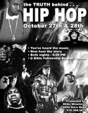
Notes:
Bible Fellowship Baptist Church
Sacramento, Calif.
Created by Glenn Robinson
Bible Fellowship Baptist Church is a small, conservative congregation with about 80 members. Their youth group, Real Ministries, has developed from four kids last year to an average of 40-50 this year and serves as an outreach to many city kids.
They’re doing a two-night video series The Truth Behind Hip Hop by ExMinistries. Their youth pastor, Glenn Robinson, used to be involved in the local hip hop scene before coming to Christ.
Glenn has a little Photoshop experience and put the flier together himself, hoping to spread the word about the event and give students something they could pass out at school.
Questions:
- What do you think of the design?
- What do you think of the text?
- What do you like about the approach?
- What would you change?


MJ Taylor
October 26, 2005
I work in marketing, but unfortunately don’t have an eye for design – sorry. [I’m part of the neo left-brained marketing specialists.]
I wasn’t sure if they’ve gotten them printed yet or not, but if they haven’t my correction would be that “ministries” is misspelled.
I know that’s not quite what you’re looking for, but I thought it might help if they were looking for changes.
glenn
October 26, 2005
Whoa! I can’t believe I missed that! Thanks for the spell check . . . I’m correcting it right now.
Stu Mcgregor
October 26, 2005
i think it’s good and will serve the purpose well and so i’ll only offer options.
i wonder if it’s a bit too busy, even for hip hop? the thing that grabs my eye is the title, which is great, but the rest of the imagery is difficult to enter into. (but then so is a lot of graffiti).
i would go landscape. get all the images around the same size and aspect as each other and turn these individual players into a crowd or a rabble. make “the truth behind hip hop” more of a design element rather than just words : big and interestingly laid out. lanscape will let this happen quite well, and it would be a little different than the other posters or flyers going around.
those are just some thoughts, but hey, it’s working as it is, though i think it has the potential to be more impacting.
Lose the @. it’s kinda overworked nowadays. also, lose the bullet points, they aren’t contributing at all to the meaning or ease of reading the text.
my final issue is a question of copyright? are we allowed to use these publicity images? i don’t know, maybe someone else does : actually copyright could be an interesting thread to introduce…
jayson
October 26, 2005
Try and put the text in the center with “hip hop” more prominant.
Michael
October 26, 2005
I applaud your efforts, it’s great to see you meeting kids where they are.
I do have some comments as it doesn’t appear these are printed yet.
It looks like you have a concept started with the flame in the background, expand on that and work it through the piece. Determine your concept and massage it through the entire piece. For example you might work it into the headline.
Work with a grid, in page layout everything should have a reason it is where it is.
Drop the bullets, they just don’t add anything, again everything should have a reason it is there.
I think where I might start is to look at the hip hop artists you are speaking about, look at their website, their promotional materials etc. They’ve spent a lot of time (and money) to know their target, use that information to tighten everything up a bit.
Keep at it!
corey
October 27, 2005
It may be splitting hairs, but I also think about any kind of visual promotion you’re doing *on behalf* of these hip hop artists. You might consider finding a good picture with a strong shape (perhaps the muscle-bound guy in the center) and doing a knockout of the shape. In that case, the shape and message would be there without actually advertising for the individuals (or blatantly stepping into potential copyright issues- if those are an issue).
That would also allow you to bring the fire to prominence in the design. I believe it would also allow the text to pop more. As it stands now, the hard contrast of the edge of the text has to compete with some hard edges of the black and white photography. If the only actual photograph in back was of fire which has softly blending contrast, then the only hard edges belong to the text.
kelly
October 27, 2005
i think it would have been cool if the text was in the fancy “hip hop” kind of font- the kind of font you see on g-unit shirts and albums.
Melissa
October 27, 2005
I think this is great and will be even better with some of the design suggestions already posted. Copyright issues not withstanding, I think you should keep the images of the artists–they will resonate with the kids you’re trying to reach…
kevin
October 27, 2005
I like the idea of not relying on the images of hip hop icons. It’s kind of the easy way to do the design. I’d love to see something that played more with the imagery of hip hop, like something using graffiti (and Glenn, you seem to have some skills in that area). I think you could still tie-in to the whole hip hop idea and still reach teens without using 50 Cent’s mug.
I don’t know how the video series deals with it, but it’d also be cool to play a little more with the contradictions inherent in gangsters thanking God and having Kanye West of “Jesus Walks” fame on a poster like this.
zeek
November 19, 2005
This design looks a little to busy. Maybe a picture of a mic or some turntables might be better juxtaposed with a cleaner font. Also, this might not draw in folks who are into hip-hop and are not Christians, because they will know that they are just going to be against all the folks on the flier.
jefferson
February 21, 2006
Great topic, wish I could attend! Here’s an idea, what if you found an image with a prominent rapper, like the ones you have already, looking over their shoulder, like the viewer is behind them. Then using some unique typography treatments, write the word TRUTH on their back, as this is what you are trying to present is what really goes on “behind the scenes”, that people don’t always see.
Just a thought, and good luck with your event.
RC
February 22, 2006
Funny to see this post…one of my students today was talking about how Eminem is a real rapper b/c he talks about Truth…it’s not about cars and money…but and-I-quote “Everything he says is True.”
Let’s just say, this led to an interesting conversation.
–RC of strangeculture.blogspot.com