A graphic designer is given the job of marketing and promoting a church’s women’s conference. Offer your input and ideas for this week’s peer review.
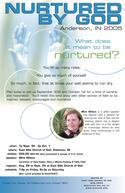
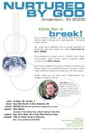
Samples: Posters and a brochure for an upcoming women’s conference.
Brochure:
Poster 2:
Notes:
East Side Church of God
Anderson, Ind.
Created by Jodi Hull
East Side Church of God is hosting a Women’s Conference called “Nurtured by God” on Friday night September 30 and Saturday October 1 from 9 a.m. to 3 p.m. The church averages 900-1000 weekend attendance. Events like this promoted only within the church usually bring in 75 people. They also hope to bring in 75 more people from the community.
Registration opens this Sunday, August 28. They hope to have a PowerPoint or DVD promo to use in the Sunday service, though they’re lacking a creative angle for it (our suggestions might be a bit late, but if you have something simple and good, it might help).
They’ve also planned several other ways to promote the conference:
- Holding an informational meeting with representatives from other churches where they’ll pass out promotional materials and hope to get other churches on board.
- The conference speaker will be interviewed on a local Christian radio station in early September.
- The local library will display a poster announcing the author’s visit and have copies of her books available.
Questions:
- What do you think of the overall marketing strategy?
- How do the brochure and posters work visually?
- What about the text?
- What do you like about this campaign?
- What would you improve?
- What’s a creative angle for the PowerPoint/DVD promo?
- What can you apply to your church?


Betsy
August 23, 2005
Wow. There is so much I love there!
I love the continuity of design — it all works so well together. The circles are wonderful. The font and lines are simple and clean. It’s really, really beautiful.
I love the copy. Some of it was too small for me to read in the pop-up window. I really liked the “hook”: You fill so many roles. You give so much of yourself. So much, in fact, that your soul can be left feeling parched and dry. That will really attract women.
Hmmm… ideas for the PPT/DVD? The whole design with the cool blues and circles evokes water to me. Perhaps (this would be a video) video of drops falling into a pool of water, with the “hook” (above) either v/o or text on screen. Nice, soothing music would be great, too.
Michael
August 23, 2005
I think it’s quite nice. As Betsy said, way to go on keeping constant in your design and true keeping the same feel throughout.
Couple of thoughts:
The lines running down the left gutter don’t seem to belong, especially in the brochure they aren’t connecting anything so the seem out of place.
It would be interesting to see different imagery other than the hands. Though this connects with many christians, not sure if it is “global” enough. Maybe something with a bit of a surprise, the mind likes to be jolted-it’s how it is woken up and leads to memory…maybe something connected with time for a break…how about a mom with a picket sign…not sure…my creativity has been sucked dry…sorry…
Have you considered the subhead of ‘time for a break’ as your heading? Again it would be more global, every mother/wife …heck person, can relate to needing a break. Then move in to ‘be nurtured by God’.
Just some thoughts…well done. I love this new section, it shows what churches are doing so that they don’t suck!
Keep it goin!
Anne Jackson
August 23, 2005
I didn’t have enough time to look all the way or read, but it looks great. one thing i thought is on the front of the brochure, maybe just leave the question and put the you fill so many roles on the first page they see when they open it..so there are kind of two hooks, a question, a teaser/interest grabber….
1 cent for now. :) colors are great. very relaxing.
Brian Baute
August 24, 2005
Wow. Excellent work.
It’s also a great illustration of how much church marketing and Christian product marketing is driven toward women. Why do I say that? There’s nothing in this excellent package that distinguishes it from most general church marketing materials. A men’s conference, however, would surely have darker colors, distressed fonts, bold challenges, etc. I think this package will be very attractive, and I think it illustrates on major reason why so many churches struggle to attract men – because they’re using techniques, strategies, and styles that appeal to women!
Suzi
August 29, 2005
I think that I agree with Michael that “Time for a Break” might be a better lead in. Then the women can be “nurtured by God.”
I do like the pictures, the colors, and the presentation.
Jessie
June 23, 2008
I think this is a really lovely design…fresh, appealing…I went looking online for some ideas for a conference brochure I’m designing as I have tired ideas right now!! Wanted something really ‘grabby’…dont’ think this is ‘grabby’ in a cool, out-there kind of way – but it was definitely appealing and made me want to look at it…and evoked a feeling from me…so think I’ll go with the ‘lovely, feel-good’ feel of this kind of design for my brochure, instead of the edgy,’ cool’ look I went looking for!! haha…i hope all that sounded complimentary! Cos it was meant to!! The fact that I was looking for something quite different to this, shows that it had the power to draw me in. Great design!! Well done…from downunder (NZ)
God bless!!
I love this site by the way – stumbled upon it for the first time today…I’ll be back! I don’t want our church advertising/promos to SUCK!! (a universal word, obviously!! :))
jessie
June 23, 2008
Haha…I see my comment came three years after the other ones!! :{