These are a few random samples from Image Ministries and their various marketing efforts, mainly because I couldn’t pick just one. If you’d like your stuff to get the peer review treatment, check the details and submit your stuff.
Samples: Various marketing samples including direct mail, banners and sermon series promotion.
Banner:
Postcard: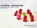
Sermon series poster: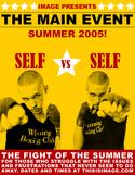
Notes:
Image Ministries
Alexandria, Va.
Created by Robert Murphy
Image Ministries is a small church ministry growing out of a larger church, Calvary Road Baptist Church. It started as a singles ministry, then a young adult ministry, and now has kids and families. They draw around 150 each week. This is a small sample of what Robert sent, just to give you an idea of the different things they’re doing.
The banner features one of the church’s primary visual images and is used for outdoor festivals, community wide events and anytime they need a large vinyl banner. The concept of the gummy bear postcard is to grab people’s attention and confront the uncomfortable feelings often associated with visiting a church. They haven’t decided if they should use this, but if they do it would serve as a first contact mailer or developed into a poster for use in local coffee shops. The sermon series poster is an 8.5″ x 11″ poster promoting their summer series, “Self vs. Self.” This piece tried to emulate the old boxer posters of the 1930s-50s.
Questions:
- What’s working with the design?
- Of the three concepts which engages you the most?
- Is the writing working?
- What could be improved?
- These samples have minimal contact info (usually just the web site). Is that a good idea?
- What ideas could you steal for your church


Brian
August 5, 2005
Like the gummy bear idea quite a bit… it grabbed my attention. If you are doing a series of postcards watch the main text area that they are similarly placed on each card to help create synergy. On the eyes postcard the text floats well in the open space and is balanced better than on the gummy bear postcard. I think the text is too close to the edge. I would also try a combo of sans header (Avenir) and serif sub text(rockwell?)… might make it pop a bit more. Good start!
Dave J.
August 5, 2005
The gummy bears are a definite pull. Would be great branding to repeatedly use them for other promos.
The copy sucks IMHO. I wasn’t sure if it was for a church marketing/image consultancy and nothing else there to tell me otherwise. This could be fixed by changing the tag line just a bit:
“come find out how we do it”
Peter Bishop
August 5, 2005
I dig the designs. I like it alot…. Im puzzed on the copy too….Maybe you could say”come find out why.” instead of how….??? In Reading it if you put “how we do it..” I would instantly say.. do what? make it complicated? make it bizzare? so… “church doesn’t have to be complicated or bizzarre. come find out why. Just a thought
Anne Jackson
August 5, 2005
the gummybears kind of freak me out quite honestly. maybe the reason is to show that you don’t single people out but it looks like all the red ones are going to beat up the green one. the concept of using gummy bears is cool, but the way they are standing confuses me.
as far as your font, i see how you are leaving it the same as your identity and i don’t think there’s anything wrong with that at all.
minimal info has proven to work best in our situation. maybe yours too.
i wouldn’t steal anything for our church (no offense intended) but i think there’s too much stealing going on as there is.
keep up the creative stuff!
Cameron
August 5, 2005
I also do not really like the gummy bears. It almost seems like there’s something odd – like the red ones are bowing down to the green.
kevin
August 5, 2005
It does kind of look like the red gummy bears are going to beat up the green one. Or offer him as a sacrifice to the first human hand that comes looking for something gummy and tasty. Which maybe ties in with the tagline (visiting your church won’t make you feel like the green gummy), but it’s a stretch
I still like the visual though–it does grab your attention. This doesn’t tie in with the tagline you have, but it might be interesting to do something with lots of differnt colored gummy bears, make it less of a red vs. green and more of an everybody’s welcome.
And nobody’s said much about it, so I will. I really like the boxing poster. I’m not sure how much it ties in with the sermon series (seems like that might be a stretch, and if it is that would diminish the coolness of the poster), but it’s a very arresting image. I think it’s well done and it looks cool.
Best of all, this is a good example of the right way to copy something. In my post from last week I talked about the wrong way to imitate culture, and lots of people pointed out that artists do that all the time. Which is true, but you need to imitate something and still make it your own. Doing something in the style of an old boxing poster is much different from doing something in the exact look and feel of a Subway logo. This is a perfect example of when it works.
Kerry Graham
August 5, 2005
I love the Boxing poster — especially the yellow — very striking. Great job!
The other two… I like the use of open space and the font choices. But I don’t get the gummy bears at all. Are they mocking the green bear? Laying hands on him? Attacking him?
The text is also confusing. It almost sounds as if it is an ad for a church conference that is presented by something called Image Ministries.
I’m guessing its “image” as in “the image of Christ”. But my first impression of “image” is that of shallowness / image is everything. If it was “Image Fellowship” or something like that, it might make more sense to me.
Stu Mcgregor
August 5, 2005
i think they’re all nice. though i’m not convinced about the DM strategy…i notice that the boxing poster was for a series that started in june (website): i’m wondering how it worked for them in the end?
also, as a pastor i would feel an enormous amount of pressure to deliver the goods. was the campaign representational of the product?
i know these aren’t specific concerns for these in particular, but i’m still interested in the answers.
also, i’m interested in the androgyny of the boxing poster : was that deliberate?
they are good pieces of work, raise interest and leave positive images in the mind after encountering them.
brett
August 6, 2005
1. Who is the target audience for this church? It seems to be someone who believes church is complicated and overwhelming. //I know I should go to church, but it’s just too stressful. I read this and think, “Hey wait, FINALLY, a church that is not complicated or overwhelming!”// Do I go, now?
What moves you? Hone in on your audience. What moves them? Connect the two.
worship. community.
Wipe away the tears. See clearly. Find out how.
I would also add – Sundays 10.00 AM, 202 Your Address Road.
Whenever possible, make your appeal positive. Avoid the un-cola approach for church i.e. we are the church that doesn’t suck.
2. This image needs too much explanation. It’s powerful though, just not sure for what. Hang on to it for future use.
3. Is the main event a sermon series? I need more info. What are you asking me to do?
Robert Murphy
August 8, 2005
thank you all for the comments, im taking this all to heart, and back to the design table.
as for the much disputed gummy postcard… i agree, i need to work on the tag line. the idea was to deal with the uncomfortable worship style that makes those that have been burned by churches in the past (our target market) feel uncomfortable. atleast in the area i work, people come from some pretty sketchy church backgrounds and have a difficult time emotionally when it comes to settling into a church. the idea was that we dont have bizarre rituals or uncomfortable services. the gummy bears represent this uncomfortable ritual… the bizarre unexplainable… this, i now see, needs to be explained better through the copy. the words “worship. community.” is a tag line ive been playing around with. it is the two main purposes in our church, and will be better defined through our next website. we have been trying to find out where people’s issues lay with coming back to church and what they really wanted out of a group of like-minded people. people around here ONLY want a sunday worship service and a community group to invest into and be invested in. so perhaps a better tagline would be, “just worship, just community, nothing complicated”.
as for the boxing poster, our ministry markets to the 18-35 age range. during the series our pastor, Chris Rhodenhizer, spoke on specific personal struggles that seem universal; i.e. insecurity, patience, hope… understanding that our people are continually traveling in the summer, we always try to create summer series that can be picked up at any moment. with that said, i didnt want to give to much information, just a visually appealing graphic that creates a desire for further interest.
thanks again everyone, this has been very helpful.
Greg Vennerholm
August 17, 2005
Copy matters… and so does “phrasing.” Your first two postcards make it (at first glance) about worshipping community… you might want to tweak that just a bit. Might be as simple as adjuting the postioning to not have the two words read as a phrase. Just a thought.
I like the gummy bears, though I think a different line fo text might explaing it better… like “we like unique.” or “come as you are.” or, well you get the idea…