 About ten days ago we celebrated our one-year anniversary and posted a significant redesign. Thanks to everyone who gave input on the design and wished us a happy birthday. We wouldn’t be here without you.
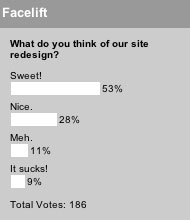
With the redesign we launched a new poll that we hope to update weekly. When we post a new poll we’ll try to share the results of the previous week’s poll (just in case anyone else loves stats as much as I do, even though we all know online polls aren’t very scientific).
Our first week’s poll (which actually covered ten days) asked for your opinion on our redesign. 80% seemed happy with the new design, which makes us pretty happy.
Be sure to check out this week’s poll, asking if it’s acceptable to wear hats during a church service.


Tim
August 1, 2005
What happens when you put your pointer on a link is awful. You can barely read the text, thus it is not usable.
Other than that, it looks great!
Michael
August 1, 2005
I never noticed that Tim, I guess I don’t go to the sidebar a lot…it also bounces/jumps when I go scroll over.
You fixed the text getting cut off…way to go. I’d still like to see it a wider and using more of the width of the monitors real estate…but that’s real just me nit picking…I think it looks good. Love the image of the lady vacumming! Very nice.
The biggest changes are my favorites here, the peer reviews to be specific are a GREAT idea.
Keep at it.
David Zimmerman
August 1, 2005
I like it a lot, but its a rather slow page load (even on my cable modem).
glenn
August 2, 2005
dude,
the redesign is cool. i wish i could add a lot of the features that you guys have going on here to my blog . . .
the poll idea is great. i’ve already thought of several poll questions that i would post if i had something like that going on . . . .
keep up the good work!
Noam Sohachevsky
August 2, 2005
Seems a lot more cluttered than before. You had a really clean design using bold images, colour and typography. You rcontent was elevated by these elements.
The numerous visual styles compete with your content.
Did you use a different designer this time round?