Last summer my family went on vacation with my in-laws to Branson, Mo. When Sunday rolled around it was defaulted to me, being the pastor in the family, to pick a church to attend. I didn’t know anything about churches in the area so I resorted to Googling “Branson church.”
I found myself looking through about 30 websites spending on average only 15 seconds at each website. These 15 seconds were first impressions. First impressions are no longer physical but virtual. Before someone pulls into your parking lot or shakes a greeter’s hand at the front doors, visitors have already visited the church online.
I finally narrowed down my selection of churches based upon the website that removed the most unknowns concerning what I would be experiencing on a Sunday. Many churches answer these unknowns on a “New Here,” “What To Expect,” “FAQ” page or throughout their website . We need to help answer as many questions and remove anything that would hinder a first-time guest from attending our worship services and physical building.
The must haves for a first-time guest on your church website:
- What does the pastor look like? It is highly likely that a church will take on the character of the pastor. What does the pastor look like? How old is he/she? 35 or 65?
- What size of church is it? Provide a photo/video showing the main worship space. Is the church 50 people or 1,050 people? Modern or traditional?
- What Do I wear? Nobody wants to show up in a suit whenever everyone else is wearing shorts and sandals. Let them know what the pastor will be wearing.
- What happens in a service? What’s the format and how long does it last? What’s the music like?
- Will I be asked to give money? One of the greats misconceptions of the church is “all they want is your money.” Help lower peoples’ defenses by letting them know up front what you are expecting of them.
- What do my kids do? Do they attend the service? Is there something that targets them specifically? And if there is kids’ programming, where is it?
- How do I get to your church? Provide an address, map, link to Google Maps. Tell people where they can park.
Examples of some great “New Here” pages:
- The Oaks
- Mars Hill
- Northpoint
- The Fields (OK, this is my church)
What strategies has your church been using to help answer the unknowns? What would you include in this list?
 More:
More:
- Learn more about how to welcome church visitors with this massive collection of resources and blog posts.
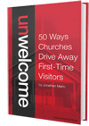
- Walking into a church for the first time can be scary. Check out Unwelcome: 50 Ways Churches Drive Away First-Time Visitors by Jonathan Malm for practical ideas and perspective on first-time guests.


Karl Udy
September 12, 2012
On our church website, instead of a google map, we use google transit to provide directions to the church. It is prefilled for arriving at church by 10am the next Sunday. They just need to enter their address. In a city where many people use public transport, it is very useful for people to know which bus, even that there is a bus that will take them there
Adam Ratliff
September 13, 2012
None of those “great examples” addressed all your criteria for a great first impressions site. The Mars Hill guide gives an overview of the church, but the rest are just a few lines of generic questions with uncreative answers. Most didn’t even have pictures beyond stock images. Three out of four didn’t show the pastor or dress code. Is there anyone out there doing anything creative with this all-important page on their church website?
Evan Courtney
October 1, 2012
Adam – Thanks for your comment and adding to the conversation. A church probably wouldn’t have one specific page that will all of these “must haves.” For us personally, we have a page that covers a majority of them, but then we answer the others through out website.
Daniel
September 13, 2012
My wife and I just moved to a new town, so we’ve been looking at a lot of church websites lately. My favorite so far was the church that encouraged me to read the pastor’s pamphlet on worship explaining the how and why of their worship style. Nooope.
If I ever build a church site again, I’m going to push to flip the paradigm… Since a visitor will only give you 15 seconds, the front page should be for them, and there should be a link that says “already go here?” that takes you to all the stuff that only members are interested in.
Evan Courtney
October 1, 2012
Great idea! Love it.
Jimmy
October 2, 2012
Love the article. I have been stressing for years how important a website is for people. I wouldn’t dare walk through the doors of a random church without looking online first. And there is no way I’d leave my son in a weird nursery or with weird sunday school teachers. I have to feel comfortable at home viewing the church before I’d attempt to walk through the doors.
Scott
October 2, 2012
Great list — thanks! To these ideas (and the other ideas in the comments), I’d add: “What are the core elements of your theology and its application to real-world issues that I might find appealing or distasteful?” For example, is this an answer church or a seeker church? Does this church have a stance on gender, GLBT, abortion, etc? No need to attract someone based on your website only to have your basic theological approach or your stance on various social issues make them want to leave.
Joel H.
October 5, 2012
To this I would add the importance of having someone in charge of first impressions — what I call a Chief Impression Officer: http://blog.joelmhoffman.com/2012/09/12/who-is-your-chief-impression-officer/
JMH