Websites tell the world (or in this case, Vermont) who you are and where you’re located. They also are essential for search engine optimization (SEO), staying in touch with church visitors and members and acting as a communications hub.
People may not remember Sunday announcements or see your social media updates, but they can always visit your site to see what’s going on this week.
During Creative Missions 2016, the teams worked with several local churches to communicate their culture and focus on a core message—usually joining them for Sunday morning worship or supporting the ministry. Take a look at their work.
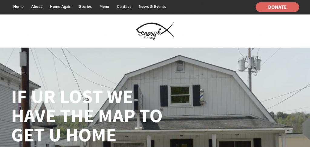
Enough Ministries
Enough Ministries is a homeless ministry based in Barre, Vt., though they do have Sunday service. With this website, the aim is to increase donations by sharing not only the organization’s story but also people’s life transformation stories.
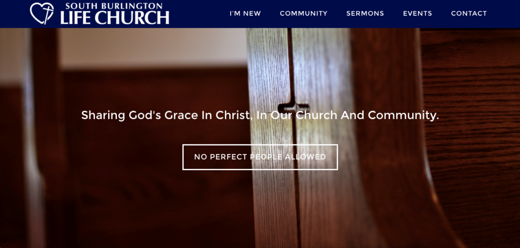
South Burlington Life Church
South Burlington Life Church desires people to feel comfortable coming to and through the doors, hence the prominent “no perfect people allowed” message on the home page. The landing page shares what visitors can expect during their first visit.
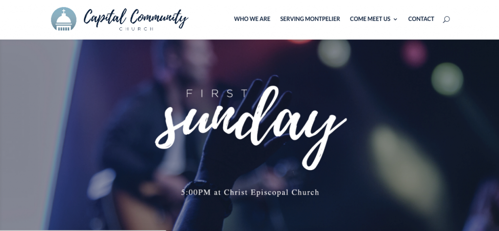
Capital Community Church
Capital Community Church in Montpelier, Vt., wants visitors to feel what it’s like in their community, so their site opens with a visual montage of photographs, drone video footage, and information. The scrolling visual media contains a link to their latest event, which can be easily updated as the church has new ones to invite Montpelierians to.
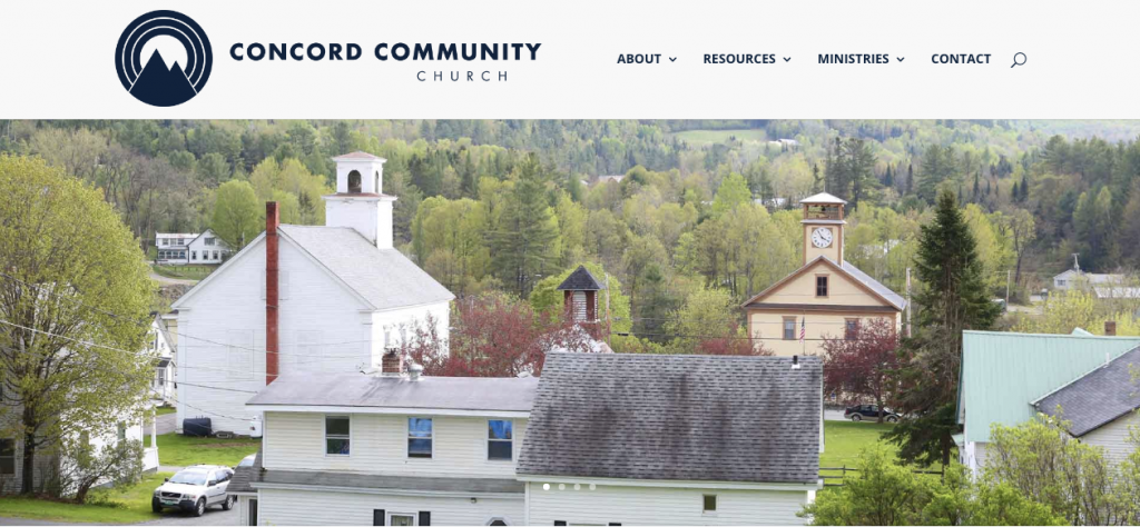
Concord Community Church
Concord Community Church also uses a visual format to show who they are and share information about their current sermon series. Their site has a minimalist aesthetic that echoes the local community’s spirit and showcases the surrounding foliage in all its beauty.
Faith for Life Church
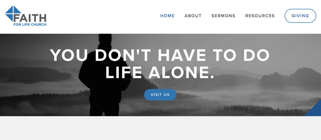
Faith for Life Church, nestled in Castleton, Vt., also foregoes moving elements in favor of a static image and message. Theirs is equally simple and memorable: you don’t have to do life alone.
The words are followed with a call to action to visit the church. The other feature to note is the “giving” navigation element. Faith for Life emphasizes it so that the giving page is easy to find and use.
Web Design Resources
Are you working on a website design (or redesign)? Check out some of our resources.
- Design Basics: 5 Things Designers Need to Teach Non-Designers
- 8 Ways Your Church Website Can Welcome First-Time Visitors before They Arrive
- Design Basics: How to Avoid the Overused Lambs, Doves, and Flames in Your Church Imagery
- The Ultimate Church SEO Guide: Website Optimization
- Design Basics: Moving Beyond Stock versus Original Photography
- Getting Started: Web Basics book
And, stay tuned. We’ll have more Creative Missions 2016 work to show you in the upcoming weeks.
This is the work of Creative Missions, helping under-resourced churches communicate with excellence. We invite you to learn more about our work and consider making a donation.




John
August 3, 2016
What font is used on the capital community church logo? Looks really good, great job
Paul
August 5, 2016
Nice websites! What platform did you use to build the sites?
James
October 20, 2016
Some nice sites but someone might want to have a word with Capital Community about optimisation – the home page is 45MB REALLY!!!!!! https://tools.pingdom.com/#!/l4t6i/http://capitalcommunity.net