Branding materials communicate a visual story about a church. Colors, composition and—if necessary—words, share a church’s values and vision, establish its identity, and disclose information about a project, church-wide event, or sermon series.
The materials also attract attention and act as reminders. People may forget what someone says from the stage, but they’re likely to remember the card they got from the welcome team. They might even tuck it into their Bible or hang it on the fridge.
The tactic works, explaining why it played a large role in Creative Missions 2016 work. The teams worked with 12 Vermont churches (five pictured here) to design new logos, update existing ones, and create materials for print and web.
Enough Ministries
Enough Ministries wanted a welcome card for Home Again, a place where homeless families can stay until they’re back on their feet. The card shares some of the home’s back-story, but it primarily gives hope and lets guests know they’re loved.
Summit Church
Summit Church has two logos, one for the church and one for its kids program. The second uses the same font and accent colors to convey that the program is part of the Summit Church family.
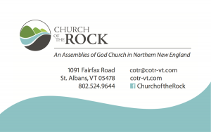
Church of the Rock
Church of the Rock needed leave-behinds, so the Creative Missions team crafted new business cards that the pastor and elders could hand out. The team also created letterhead that echoes the business card with its fonts, colors, and design elements.
Faith for Life
Faith for Life‘s congregation enjoys the printed bulletin. The team created a frame that the church could easily update with news, announcements, and other information. They also enhanced the design with a space for sermon notes.
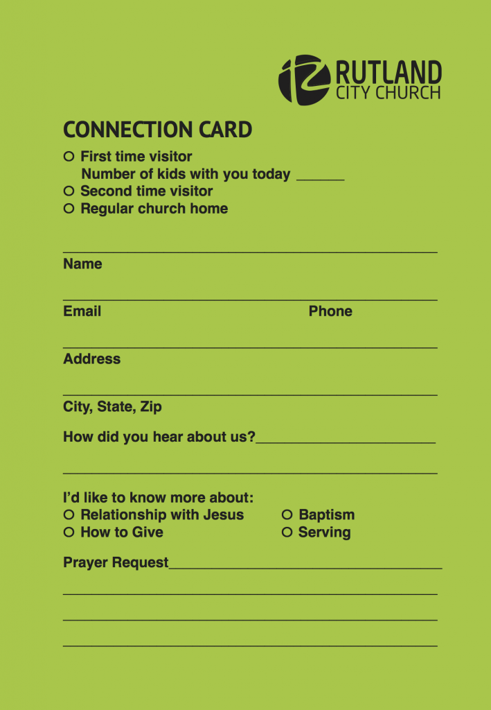
Rutland City Church
Rutland City Church desired a way to easily connect with first-time visitors. The answer was a redesigned connection card that visitors could fill out during the offering.
Working on a branding project? Check out these five resources.
- Branding and the Local Church
- Church Branding on #cmschat
- Design Basics: How to Win with Simple and Consistent Branding
- Branding Overload? You Need a Brand Overlord
- The Branding Process: Start to Finish
Stay tuned! We have a few more posts about Creative Missions 2016 coming soon.
Image: Jeff Turner (Creative Commons)


Mark Steinbrueck
September 7, 2016
Great post, Erin. Many churches feel that branding is something that should be left for corporations and the concept of marketing a church or the gospel is “wrong”. IMO, branding of your church is just a way to get recognized, get folks in the door, and get remembered. As long as the Message is still the same, it is a good way to spread the gospel.