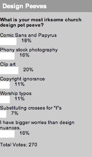
 This week we took a good, long look at the pet peeves we all love to hate. I’m sure the poll was met with cringing and gnashing of teeth, with all wishing they could select multiple options. Unfortunately, you could only choose the most irksome error, and here’s how you voted, in a surprisingly tight race:
The winner? Clip art! You don’t like to see “designs” like these popping up in church materials. They’re funny on the Internet, but things get serious when they make their way into real life. Just behind clip art are Comic Sans and Papyrus–the favorite fonts of churches across the country. But really, there’s nothing funny about Comic Sans. Plus, Jesus hates Papyrus.
Next up are the 16% of you who hate phony stock photography. Your church looks like a whitewashed cross-section of Average Joes, but your stock photography has six friends of mixed races playing cricket. And rounding out the artistic answers, 7% of you are most peeved by churches like “Turtletop Town Church in Tottlesville, Tennessee” who have eight crosses in their logo–one for each “T.”
Beyond that, 11% of you are tired of churches ripping off art. They’re copying music or designs or anything they can get their paws on, and they’re not following copyright law at all. Another 11% of you are tired of churches messing up the music lyrics. There are only a handful of words up there, they ought to be able to get them right.
Finally, 16% of you are above all of these pet peeves, and you have bigger things to worry about. Bummer, design pet peeves sure are a lot of fun.
This week, we’re looking to hear: What aspect of your church building would you most like to give an extreme church makeover?


Andy Wittwer
December 15, 2009
Next up are the 16% of you who hate phony stock photography. Your church looks like a whitewashed cross-section of Average Joes, but your stock photography has six friends of mixed races playing cricket
Our church is currently working on a photo collage/art piece for our parent’s room and this issue came up with my graphic designer – we’re a predominately white church in a predominately white city; if we were to reflect the racial percentage in this piece, everyone would be white. The problem is that art doesn’t only reflect who we are, but who we want to be. As a white dude, if you walk into our church, you’re not going to wonder if you’re welcome because everyone looks like you. But if you’re any other color, you just might wonder. Art gives us the opportunity to say “Yes, you’re welcome here.”
I understand the potential to misrepresent – but I’d rather fault on the inclusive side of this scale.
Arvell Craig
December 18, 2009
“Your church looks like a whitewashed cross-section of Average Joes, but your stock photography has six friends of mixed races playing cricket.”
Oh how I loved that quote.
But anyway, Josh – thank for these results. They are very helpful. Perhaps I’m not a real critique as some people, but this helps for future projects.
Arvell Craig
Michael Buckingham
December 20, 2009
Hey Josh, thanks for the link. You know all these choices come down to why Jesus Hates Papyrus : mediocrity.
Too often we look for the quick and cheap solution, especially when we talk about creative.
Instead let’s create things that are red hot and show our passion not just for great creative, but for the story we are telling and for the God we serve.