Check out the web site of The Refuse, a Colorado Springs church for “the left out and right brained.” Share your feedback in this week’s peer review, and consider submitting your church’s marketing materials for a future peer review.
Samples:
Screenshot: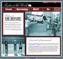
(therefuse.net)
Notes:
The Refuse
Colorado Springs, Colo.
Created by Brian Behm
Scum of the Earth is a sort of alternative church in Denver for those who don’t feel welcome in the typical Sunday morning church. It was made famous partly due to the involvement of several members of the now defunct band Five Iron Frenzy, though I imagine the church tires of hearing that all the time. A Scum of the Earth small group in Colorado Springs eventually turned into a church plant and The Refuse was born.
Attendance is anywhere from 15-50 at their weekly Tuesday night services. Being in the evangelical mecca of Colorado Springs, they have to deal with serial church-goers who attend two or three churches. They’re trying to reach beyond those people to the unchurched population (Behm notes that church attendance in Colorado Springs is lower than the national average).
So they’re a different church that wears their heart on their sleeve, but they’re also fairly traditional (they do sing hymns). They’re wondering how to best express all that in their marketing. The web site is fairly new and something they’re hoping to grow into, expanding it as they add new features. They want to know what works and what doesn’t, what should be there and what shouldn’t, and what they can do to increase awareness of their church.
Questions:
- What’s working with the web site?
- Is the necessary info easy to find?
- What do you think of the design of the site? Too edgy? Edgy enough?
- What do you think of the writing on the site?
- What’s your favorite feature?
- What would you add to the site?
- How else could they raise awareness for their church?


kevin
October 6, 2005
My favorite part is the Nuns with Guns flier. Hilarious.
Ron
October 6, 2005
What’s working with the web site?
Design is nice and modern.
Is the necessary info easy to find?
Yes, I think it was well organized and had the most important information easiest to find.
What do you think of the design of the site? Too edgy? Edgy enough?
I like the overall look. I like the photography on the about page. Its original stuff, and shows the actual church, not some stock company.
CSS and HTML don’t validate.
I’m not fond of the title font, its a little hard to read. Also the main font size is a little small.
What do you think of the writing on the site?
While reading the about I wasn’t able to pin down whether it was aimed at Christians or non-Christians, which I decided in the end was good. It achieved a balance that I think works.
“It’s scientifically proven that there’s nothing cooler in the world than a giant robot.” Love it!
What’s your favorite feature?
I like the t-shirts. I also like the hybrid google map map.
What would you add to the site?
A blog. Connect with a real person.
Peter Davidson
October 6, 2005
Nice site. Enough design to appeal to the demo.
I disagree with any critiques of font choices. With this demographic the traditional notions of legibility for headlines are not relevant. They are used to slightly challenging typefaces.
One often overlooked source for visual inspiration is a trip through a 20 something’s CD collection.
I totally agree that they need a blog.
A deal breaker for me is any church website that lists three week old events as upcoming.
Don’t put timely information on a website unless you have someone committed to updating it.
Michael
October 6, 2005
The site reminds me to much of Emo-esq. band sites, but if those are the demographics the site/church are going after it make be a good marketing ploy (I mean no disrespect using ploy).
I like the idea of using the podcast instead of regular mp3/wma downloads because it has the church keeping up with current technology, now I find the only problem could be is becoming to trendy the “In the world, not of the world” kind of philosophy. I worry that Christians sometimes look as Christ needs to be trendy to be heard.
I realize you guys probably do not think that way, so I am merely stating what I think could be interpreted.
The site is designed is good, I don’t know if it’s an IE problem but the “US” page comes up screwy.
–(PS, don’t really click on the URL provided the page is no where near complete)–
Stu Mcgregor
October 6, 2005
i love it. i stumbled across it in the comments section of the last peer review and was might impressed.
as a ‘kind-a-web-designer’ myself i struggle with what works and what doesn’t. i think this achieves a huge amount of what works and anything that doesn’t, is in that fuzzy realm of personal preferences.
inspiring stuff…
Stu Mcgregor
October 6, 2005
actually just thought of one criticism…i think it’s too easy for cutting edge churches to define themselves against the mainstream and to that end, undermine the very fundamental ethos that the mainstream is generally genuine in trying to connect with the same Jesus. it’s better to focus on what we stand for rather than what we stand against. the irony of the nuns with guns poster (next post) is that it explicitly rejects the catholic heritage which has so much richness and depth if only we respect it enough to find it…(and i’m a baptist by the way).
Jen
October 6, 2005
first of all, this is my first time to the site… (sorry it took me so long brad!) i love this feature…now, on to the critique:
* What’s working with the web site?
i think the clean layout and the cool colors are great. it’s inviting and not overwhelming.
* Is the necessary info easy to find?
personally, if i’m looking for a church i want to know about the people involved, the people leading it, etc. i didn’t find that on the site, which makes me wonder if i would really take a risk on a tuesday night to check it out. i like the upcoming info, especially that they have local concerts and indie movies listed as well as their church stuff.
* What do you think of the design of the site? Too edgy? Edgy enough?
i think it’s creative. i wouldn’t call it edgy, but frankly, with a name like The Refuse, you don’t need much more edge. the scripty font, the photos, the background images all work together to demonstrate that they truly are an artistic community.
* What do you think of the writing on the site?
i’d have to go back and read it again. i hadn’t noticed anything particularly memorable on it.
* What’s your favorite feature?
the upcoming stuff–no wait, the podcast church. (it’s the wave of the future ya know…)
* What would you add to the site?
i think i covered that — info about the people involved. i’d also try to incorporate a broader representation of people in their pics. i’m not in my 20s, i’m not an artist, so when i see those pics i assume that i may not really click there (or be welcomed as “one of them”)
* How else could they raise awareness for their church?
being an artistic community in a place like colo spgs, i think grassroots will be the way to go. the independent (the local mag, filled with all sorts of crazy stuff) would be a good place to get a story/article about them (or at least to advertise).
ps – used to live in cos. could’ve used this place when i was there. it’s refreshing…
Steve
October 7, 2005
It’s the best church website I’ve ever seen! Ok, maybe that’s an exaggeration, but I’m proud of the job Brian did with this site. I think it turned out well, represents the church well, and looks pretty dang cool, while presenting the info you’re most likely to want.
The “Stuff” section is one of my favorites, with T-shirt transfers, handbills, posters, etc for people to download at home.
I know Brian, so I’m biased, but I think he did a great job on this!
Jessi
October 7, 2005
As a writer, I critique writing – often too harshly, but here I go…
I LOVE the idea of this church. I love the fellowship meal in the middle of services, I love the artsy quality of the membership and the body and the way that I think certain people will really identify with this demographic. I don’t love the copy on the Web site. I think it needs to be re-written. It’s hard to get through and not very consice. People tend to read quickly. And, short is always better. I would break up the text and re-work it a bit, but other than that, I think they have a good thing going.
s.e.whitby
October 8, 2005
high points / things that hit it
.like the visual design. seems to create order within a non-conformist message. tough to do without seeming trite, but the photos help attach credibility.
.the categories in ‘upcoming stuff’ are great. nice to broaden and show the flavor of the whole community you attract.
.the google map is well worked – relevant to the way people find things, and indicative of where you place yourselves.
.the writing is clean. the design aesthetic is clean. well implemented.
questions/better way?
.is the site geared toward the already-attenders or the soon-to-comers? looks a little like it’s built for the in crowd.
.no info offered on who’s running the asylum [staff/volunteers/etc]. as a result, it’s tough to tell if this is justa bunch of friends, or an organized community that is open to the outside – with a way to integrate outsiders.
.the propaganda is beautiful, and works well with the band-flavored site. the question becomes whether we’re creating something that looks cool, or whether we’re truly creating outreach tools. it looks like this is the most complete section of the site, and that could lead people to believe that it’s about looking cool. how ’bout including a ‘how to use the propaganda’ section on the page?
overall, LOVE the site. looking forward to seeing how it grows.
Nathan Smith
October 8, 2005
I really like the approach that this site takes, the way it fully acknowledges that we are all indeed “useless or worthless; trash or rubbish.”
From a development standpoint, I’m loving that it’s XHTML 1.0 Transitional. Very cool to see another church site with table-less layout and web-standards in mind.
Possible Improvements:
Some of the tables on the Upcoming page, while merited, look a little bit off with their default borders. Also, some of the header images don’t have any Alt text. Additionally, there is way too much use of target=”_blank” (meaning, at all). There’s good reason that XHTML 1.0 Strict did away with this. Spawning new winows is so annoying.
Aside from those hang-ups, this site has the potential to be very very good, like top-notch good. :)
zeek
November 19, 2005
This is a good design, and real nice and clean and excellent fonts, colors. I like use of black and white images, very relaxing.
zeek
November 19, 2005
I think I would actually go to this church. I am not a christian, but I like their message, it seems to really lay a great foundation for leaving behind pretense. As a preachers kid, I have seen it all in churches. Kudos to these people for taking a different paradigm especially in Colorado Springs, which is very conservative.
T.
November 5, 2007
This church, while it lasted, was a good thing. Unfortunately it became inconvenient for the leaders, so they QUIT.