The Church Marketing Lab always has design concepts for message/sermon series on display. Two recent ones caught my attention, partly because they are on the book of Revelation. Traditionally, graphics for a Revelation series are dark and apocalyptic. I appreciate how the concepts below have a different tone.
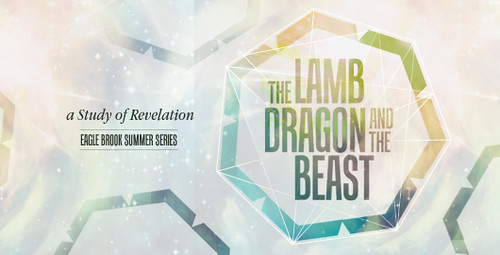
Jamie Colbert posted this graphic from Eagle Brook Church’s summer series in the book of Revelation called, The Lamb, Dragon and The Beast. The direction was to make it “nothing too dark/eerie, make it hopeful, versatile (long series); and have the colors be light.” I, personally, think it is a very successful and intriguing piece that draws me in with a CS Lewis-esque title.
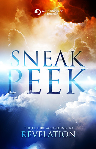
Similarly, David Choate posted a graphic from South Telegraph Christian Church from their series titled, “Sneak Peek.” His pastor wanted “this to have an inspirational feel that foreshadowed heaven.” Through the use of stark gradients, light rays, and clouds I would say, “mission accomplished!”
Be sure to jump over to the Lab to check out these and other great key-art concepts. Also, be sure to add your designs or drop some helpful feedback while you’re there!


Ronaldo Patrocinio
June 11, 2012
Whoa. These are awesome design concepts!
Ed Lauber
June 15, 2012
Perhaps it is a sign of our times and our culture that the book of revelation which was was written in dark times of heavy persecution, by a man in an exile prison (another dark element) and which deals with martyrdom, rivers turning to blood and such, needs a facelift in the eyes of “modern”, Western Christians. The art is lovely. Making Revelation un-dark, not so sure that is a good idea.