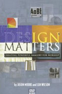
 For anyone involved in the world of church design, marketing and branding (whether new or a seasoned pro), I’d like to recommend a book for you to check out called Design Matters: Creating Powerful Imagery for Worship by Len Wilson and Jason Moore of Midnight Oil Productions. In my class at MinistryCOM last year, I talked about “leading up” and being proactive to pass on good reads to your pastors so they can better appreciate what you do. This book is well written resource for designers, but also great for a pastor to more fully understand and appreciate design, designers and the work that goes into what you do.
Topics covered in this book include how to communicate effectively in today’s image-driven culture, how to reach a world that is conditioned by television and video games, and learning to create powerful images that will move your congregation through meaningful worship experiences. This book helps both pastors and design teams think and grow as visual communicators.
The book is about as close to “Design for Dummies” as you can get and I don’t mean that in a negative way. I’m a big fan of the ” … for Dummies” series. Chapters like “Terms to Learn” and “The Basics of Design” are must-reads for your pastor and will go a long way towards improving your respect, appreciation and communication with one another. To sharpen your skills, the book addresses eight principles for effective design, including color, composition, fonts and more, and how to bring it all together, including extensive resource lists. Also included with this book is a practical and hands-on DVD, which is a great accompaniment to the book. The DVD features a series of step-by-step tutorials for putting together an image for worship.
No matter your experience and level of design ability, I think it would be a good read for anyone on here at CMS. I also encourage you to get a copy for your pastors and encourage them to read it.


jazzy
March 19, 2007
here in Brazil, we need more resources like this, i believe that this book will be valuable for me and my team.
matt
March 19, 2007
Someone should have reminded the cover designer of the title. This looks like the cover of my seventh grade social studies book. I hope the content is better than the cover, but a book on this subject does not get a pass on the “Don’t judge by cover” rule-of-thumb.
brad
March 20, 2007
Well, of course, any real designer knows that actual titles with legible English words are so “some previous era”. Sheesh.
Sounds like a timely book for the people we’re trying to influence.
John
March 21, 2007
I have this book, and it’s awesome! I’ve learned a lot from it. The incuded DVD is pretty nice too.
And as far as the cover goes matt, I think it looks great. You must have had some well designed social studies books! The designer had to to communicate all aspects of design in one image. I think he/she did that in a really effective way. Obviously good design is very subjective which is something the authors point out in the book.
This is a must have for
Bill A.
March 22, 2007
This book is great! I highly recommend it. Well worth the $$.
Phil
March 22, 2007
Not only do I have this book, I’ve read it and been to the related seminar. This is the exact type of information that every church should have when it comes to thier design styles. It has helped me “a seasoned pro” to get back to basics and make good looking stuff. Thanks for the review and thanks to Len and Jason for such a great book!
Richard
March 22, 2007
Stop reading this review and immediately navigate to online bookstore and purchase Design Matters. Implementing the techniques outlined in this book will take your images further in a shorter amount of time than any other “how to” lessons. Have it, read it, use it and teach it in our local church training sessions. This stuff is that good!
Joseph B
March 24, 2007
I will concede that there is a lot of useless stuff out there but I’ve found Jason Moore and Len Wilson not only produce quality material but they teach others to do the same. I have (among other of their publications) Design Matters and can attest to the fact that it’s a “Must Have!”
Jack Hansen
April 2, 2007
Thanks for the review. Sounds like a good-buy. I will tell our readers at PrayTalk.com.
Keep up the good work!
CH
June 5, 2007
Backing up matt who commented on the book cover: As a typophile and seasoned brand and identity developer, I say with full confidence this cover is straight from 1993. Talk about outdated design! I was quite surprised to see a publishing date of 2006. This book mimics the exact reasons why church marketing sucks. If poor churchies are looking at these graphics for inspiration, we’re in a world of hurt! Get a real design book from real designers (read: ‘secular,’ oh no!), and I guarantee the same principles of design will apply to your congregation.
kim
November 27, 2007
I got this book and it wasn’t very good at all! Perhaps for beginners, but it seemed full of basic stuff and it was badly designed! The half grey pages made it hard to read and i even found a bunch of typos!
tim
February 8, 2008
This is my first time to this site, and this post happened to be the first that I visited (being a graphic designer).
In response to John – the designer did not “have to” communicate all designs in one image. That was his proposed concept, and regardless of whether or not that was the right concept… the design is definitely poor, which is a turn off to a book about design.
Daniel Abraham
January 17, 2009
how do i get books on worshing God