Check out this logo for a New Hampshire church plant in this week’s peer review.
Samples:
Main logo:![]()
Smaller logo: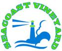
Notes:
New Hampshire Seacoast Vineyard Christian Fellowship
Hampton, N.H.
Created by Avery Moore
Seacoast Vineyard is a new church plant that hopes to launch in the next year and is trying to finalize their logo. The church is in the Hampton/Portsmouth area, an hour north of Boston. The area is predominately blue collar to upper middle class with a high percentage of people in their mid 20s to lower 40s.
The church has connections to Desert Stream Ministries (the church will be using their Living Waters program) and Bikers for Christ (both the pastor and an associate pastor are members). They plan to have “blended services,” featuring old hymns with electric guitars and organs, along with contemporary music with some Bach thrown in as the dance team dances and the interpretive painter paints (“It sounds like a mess on paper but it’s a beautiful thing to experience,” says Moore). They also plan to hold services on Friday night (including supper) to give families their entire weekend to be together.
Questions:
- What do you like about their logo?
- What works with the design?
- What works with the text?
- What do you think of the colors?
- How does the logo work for their demographic and the type of church they’re going to be?
- What would you change or improve?
Update:
After receiving so many comments Avery made a few changes to his logo and wanted to get some further feedback. He says it’s still unrefined, but he wanted to see if those who had the intense disdain for the earlier logo like this one better:
![]()


Sam Huff
September 2, 2005
I like the color scheme and the graphic very much. Nice metaphor but not too “churchy” so anyone who hasn’t been to church will still understand it. One thing I would change is the “messy” font. Being upper middle-class, these people are used to seeing professional, world-class images and so I would use a more definite font for “Christian Fellowship” so it can easily be seen as part of the name. I do, however, like the font with the tagline.
I would also take off New Hampshire. People usually know where they live (if not, that’s a whole other marketing campaign) so I think it just kind of clutters the left side of the graphic.
Sounds like an interesting and cool church and I think it will lead a lot of people to Christ in your area!
Ed
September 2, 2005
Overall a nice logo. The colors and text are good choices– both are shades of green and blue that evoke a “sea coast” feel. A serif font was a good choice– kind of an anchored feel, which is appropriate for a seacoast. And the lighthouse is a great idea, if it’s not over-used (which I can’t speak to from the mid-west).
There is also a casual quality– especially in the larger logo– that fits with the style of ministry described, and also with the general demographic of a seacoast town, it would seem. On the other hand, the smaller logo particularly also has a fairly traditional sense about it (I can’t say exactly how– maybe I’ll think on it for a while), and that doesn’t seem to fit the model described.
The absence of a cross or, in the case of the smaller logo, a reference to the fact that this is a church or Christian community may be problematic. Does it indicate a presumption that everyone will know that a “Vineyard” group is a church? Does it point to a reluctance to self-identify as a Christian organization (and if so, does it become a “bait and switch” kind of trickery to get folks in the door)?
One other question: what are the solid blue and blue-outlined “billows” on the right-hand side of the lighthouse? Are those clouds? Foamy seas? A flood about to overtake the lighthouse? It is unclear to me what function these have, except to use up space.
Again, overall a nice logo.
corey
September 2, 2005
I would have to agree with the other comments about coloring and font choice for the main title. I would suggest trying to simplify the full logo a little more. (The emblem is great in that it’s symmetrical and versatile in terms of usability.) If you look at it, there are 5 “pieces” to it: location, title, description, tagline, and icon. Of those 5, only two are lined up by any recognizable baseline (the title and icon are left-aligned). There doesn’t seem to be any kind of natural organization or flow from one end to the next- no movement, except for the fact that the title starts in the upper left and that the tagline ends in the lower right. Additionally, by “simplify”, I would add a +1 to what Sam said above. Is adding the state to the location imperative? Additionally, I would find a way to delineate between the description and the tagline. Less is more
Let me add a caveat, though- I understand that when churches hire designers to do logos, the grocery list usually looks something like this… 1. cool icon 2. church title 3. description of the church 4. location of church (city and/or state) 5. tagline/ positioning statement 6. cross 7. heart 8. screened out picture of the pastor 9. woodcut illustration of the sanctuary 10. a small listing of Luther’s 95 theses… so simplification may not be an option :)
cheap plug: if anyone’s interested in dissecting logo building, check out Before & After design magazine. They break logos down to the visual nuts and bolts with some extremely helpful and practical tips.
Sarge
September 2, 2005
I agree with above, is it a winery or church? You just say vineyard to most people and they think of wine. I like to logo itself, but I don’t care for the lime green.
Avery
September 2, 2005
I’m the designer of the logo and am really enjoying the feed back, thanks guys!
Let me try to answer a few of the questions and pose a few of my own:
1: “Christian Fellowship” font, i hear you and concure with the aspect that it’s too messy. I played with a lot of fonts on that line, at one point hving over 50 of these logos on my PC just to compare them. Give me suggestions on the font to use.
2: New Hampshire – we have ridden the see-saw on that more than you can even know. Here is the reason we put it on: 1) In South Carolina there is a Seacoast Vineyard Church. 2) the seacoast region covers 3 states in that area. New Hampshire having the least coastal area of any of the 3. Now the South Carolina church is very happy that we are planting and they like our name, but logistically we are trying to keep there from being any confusion within our denomination. Location wise we are reaching out to 3 states (I’m told it’s 15 minutes from a state border either way) With this in mind what say you? Our intent is to drop it once we are established in the community and people know who we are.
3)The small logo is intended for use on shirts, hats, bulletins, etc. That kind of stuff. The kind of stuff that you know who we are if you are seeing it and the large logo would just be redundant.
4) The billows are cloads and land, well i guess more to the point the soupy fog that covers the land on a typical seacoast morning. The same kind of soupy fog so many are living their lives in that we are to be a light to. The fog of life that Jesus is the answer to.
5)alignment issues? hmmm I don’t really know how to change that, if you left align New Hampshire it looks corny, “a community for everyone is right aligned and christian fellowship is centered. I tried a step approach to is but that was big and bulky and ugly.
Feel free to mess around with is and shoot me an e-mail of your work, I would love to see what comes out. I love this site and would love to have this be a sort of Wiki project logo. In fact I am trying to figure out the wiki coding as I would like to develope our website as a wiki page (at least parts of it) we have the doamin and hosting if anyone wants to volunteer to make the first wiki church page.
avery
September 2, 2005
oh an e-mail address
avery@seacoastvineyard.org
Anne Jackson
September 2, 2005
If you are looking for some great handwriting fonts, check out extremefonts.com. we use “twenty” in one of our logo pieces (can be seen at http://www.westsidefamilychurch.com and is a little cleaner. :) peace.
Bob Smietana
September 2, 2005
Seacoast Vineyard? Isn’t that name a bit confusing?
Stu Mcgregor
September 2, 2005
I think there are some good foundations here but (and i’m sorry about this) it generally doesn’t appeal to me at all : and i’m in the demographic you are looking to.
colours they’re quite non-descript. I would go for a stronger blue and ditch the green for maybe a yellow or ochre or something like that.
the outline on the seacoast vineyard actually reduces the impact of the font dramatically. I’d use this sparingly and usually only if there was a background that the font needed to be distinguished from.
If you are going to use the handwriting font, general rule of thumb is that use only one font. ‘ a community for everyone’ doesn’t look unified with the rest of the brand.
what about making seacoast vineyard christian fellowship all the same font?
make your graphic bigger and bolder in the wide version. in fact, i’d almost reduce everything down to let that stand out. it’s a nice graphic and with bold colours would be really striking! It’s a shame it’s tucked away in the corner there.
(my son’s just done a poo and so i’ve got to go and change his nappy. i might come back later…sorry!)
overall it’s got the seeds of a good brand if the graphic is given dominance. after all that’s what people will notice first.
Marc
September 2, 2005
i hope you are not waiting for the logo to get finished to start doing ministry. the logo should be the last thing to fret over.
Alex
September 3, 2005
This logo looks nice, but…
What does it communicate about your church and its culture?
Will it stand strongly among other logos fighting for people’s attention?
With due respect to the designer, I do not get a feel of what your church is about and what kind of place you are. If I am a non-church type, or a non-believer, what will this mark say to me to compel me to think differently about coming to church?
We are just completing a year of research and work on rebranding and have it down to two very worthy candidates. Our goals? Stand above the noise. Try not to look like other church logos. Communicate our culture and ethos to those that don’t know Christ or church. We are skewing highly toward visually communicating to the unchurched, because really, our logo will be seen publicly amongst businesses as well as other churches. Somehow, our mark must stand above the visual noise and make a bold statement.
Hope this helps. Feel free to email me if you have any questions.
Kenny (blaqenedwyte blog)
September 3, 2005
Avery,
I too am in your demographic (and a great fan of the Portsmouth/Kittery area), but with all due respect to you, the logo does not appeal to me either. And let me preface my comments by being very clear that these are just my opinions and my aesthetic as a designer. You, of course, are free to completely disagree with and disregard my views.
The first thing that jumps out at me, before I read a single word or focus in on the graphic is the colors. The green and blue combination you have chosen are, I feel, too intense. A church is a refuge, a place to be at peace, and these colors (the green with blue outline especially) just make me jittery.
The copy in the main logo does seem very complex for a “logo”. A logo needs to be clear and simple so that the viewer “gets it” immediately. It seems more like a masthead for a newspaper – something you need to read before you can “get it”. I’m a big fan of SIMPLE and I believe there must be a way to simplify the amount of copy into – at the very least – only three lines.
As for the font choices, I think others have correctly diagnosed the problem with the handwriting fonts, so I won’t belabor the point.
As for the graphic itself, honestly I wasn’t excited to see the lighthouse illustration. It really has been done before time and time and time again along seacoast communities from Maine to Florida to advertise and represent everything from churches, to restaurants, to insurance corporations, to shipping companies, to…you name it. The image of a lighthouse – as portrayed here – has completely lost the powerful meaning you explained and intended. The orientation of the lighthouse to the waves to the morning fog is pleasant and balanced. I just think it doesn’t communicate anything.
I hope you will take my comments in the spirit that I intended – of constructive criticism and peer help. Please feel free to e-mail me to discuss it further. Best of luck with your logo – and more importantly, your ministry.
glenn
September 3, 2005
I don’t really like the logo. Here are some of my (unprofessional) reasons:
»The font doesn’t “match” the name of the church. Hard to explain why, but it just seems unbefitting. Maybe it’s because the name of the church is trying to sound cool; however, the fonts communicates anything but cool.
»The colors are unpleasant. I’m an artist myself (I used to be a graffiti writer so I’m well acquainted with color schemes) and my gut tells me that the blue and lime green on a white background is somewhat offensive to take in.
»The logo doesn’t communicate the name of the church. I understand the whole “church-as-a-lighthouse-of-truth” motif, but shouldn’t the emphasis be more on the sea (where I presume the church is located) rather than on a symbol that’s not directly related to the name of the church? (I further presume that it’s a “Vineyard” affiliated church. If that’s so, then of course you wouldn’t want to draw a vineyard by the sea coast for the logo; but, if that’s not so, wouldn’t that be a cooler idea?)
»One final observation . . . in the circular logo the lighthouse is emanating two beams. These beams, however, have 90° angles at the end of them which seem to break the visual flow of the curved lettering. If it’s decided to keep that design (which I wouldn’t), I would tweak that a bit.
Sorry for all the negatives. I hope it’s perceived as constructive criticism!
I love churchmarketingsucks.com!
Phillip Ross
September 4, 2005
The thing I notice the most is that in and of itself it has no reference to Christ or the church. It could be a logo for anything. But isn’t the church supposed to be different — “peculiar,” called out, in the world but not of the world? It is! And the logo suggests nothing of this.
Phil
David Russell
September 4, 2005
Sorry, don’t have time to read through the other comments, but I will quickly say that the font has to go. Yuck. Clean it up, think brand, clarity, visibility, distinction and consistency. Definitely consider refining the color pallette as well. The outline approach isn’t working. Take a look at the logo in grayscale to help view the weightiness of the current font style.
The logo itself doesn’t necessarily bowl me over with excitement, but I get the imagery of it. (Is there more to it? A lighthouse nearby? Church meets in a lighthouse? Anyway…)
HTH. It already far exceeds 95% of what is currently represented in the church marketing world. Good luck in the revision process.
Lewis
September 5, 2005
reading through all the comments cracks me up… the nitpicking & hyper-critiquing reminds me of battles over carpet color, the placement of the organ on the platform (not a stage, I tell you!) & whether Starbucks, Seattle’s Best, or Pura Vida should be served.
Stu Mcgregor
September 5, 2005
lewis, your post is the only unsolicited “nitpick and hypercritique”, the rest of the comments are actually what the submitter asked us for…don’t feel you have to be part of the conversation.
Kenny (blaqenedwyte blog)
September 5, 2005
Lewis, the entire point of this post is to solicit peer critiques on the logo design, not to show off his work. Just thought we’d let you know.
avery
September 6, 2005
avery@seacoastvineyard.org
Thnks for all the feedback it has been very very helpful (don’t stop by the way)
Just want to state I submitted my logo (the first one I have ever designed by the way) and was looking for criticism and help on the design.
I’m going to play with this on a little bit, but I’m not going to stress over it. I’m thinking back to the drawing board totally on the concept. So with that in mind shoot me an e-mail or a post and give some suggestions on what direction you would take. You’ve read the short of what we are above, what imagery do you think conotates the post-modern urban/suburbia seacoast region come as you are kind of feel to it?
kevin
September 6, 2005
Hey Avery–Thanks for sharing your logo with us and being so willing to take feedback and criticism.
When you told me the added details about your connections with Bikers for Christ, I had a completely different image of what your church will be like. Personally I liked the lighthouse logo, even if it is a bit of a cliche image for that area. It looked good. But on hearing more about your church, I didn’t think the image fit as well.
Your church does seem to be very come as you are and very anti-traditional church. I’d think your logo should say that pretty clearly. I’m not sure what would say that (note I’m a writer, not a designer) but I think moving in that direction would be a huge step.
John
September 6, 2005
I commend you, Avery, for being brave enough to share your hard work.
A lot has already been covered, but I wanted to make a few points.
Creating a logo before you start can be difficult. You don’t really know what the church is like. You have ideas of what you want it to be, but you won’t truly know what the church is like until the people start arriving. Be prepared to adapt the logo to who your church becomes.
I am not a fan of regional names. Then tend to project a limited vision. Instead of focusing the logo on the locale, how about focusing on the type of service you intend to have. Maybe using heavy paint strokes as a background or such. If you plan on dropping the “New Hampshire” later than drop it now.
I appreciate you pursuing excellence!
Peter Lurvey
September 6, 2005
Nice, but I feel like the light shining to the left is the wrong direction. It goes against the flow of the text. Am I being picky? It’s just my gut telling me…
nashbabe
September 7, 2005
too busy…will look like a squished bug in small applications…
Lacy
September 8, 2005
Three fonts in one logo – woah! Limit yourself to two. One bolder one for the church name – and then a corresponding finer font for the subtitles. And ditch the handwriting font … that is a fad that needs to go away soon. (the only thing worse is the constant use of comic sans by churches. that font should be burned!)
Those colors definitely aren’t Pantone … and I have to wonder how they will print out on various publications. You need to use true colors (printers prefer pantone, cmyk, etc).
And I agree with many of the other comments — this logo says nothing to me about your church. Do you have a lighthouse on the premises? Perhaps if the subtitle had something to do with showing the light – or leading the way or something to do with lighthouse themes – it would make sense. But it doesn’t make sense as is.
Michael
September 10, 2005
Just a quickie…
First off, looks like you are designing this as vector…well done.
I think the colors are ok…try working with them a bit, rule of thumb: don’t use the default colors.
Overall though there is too much going on. The eye doesn’t know where to go and the brain isn’t sure what to connect to.
Couple of things to do.
-list out the response/feeling/reaction you want
-list out in one or two words they key aspects of this church
-sketch, get out a pencil and start working the above two concepts into something graphic
A couple other baselines to work with: stick with 1 to 2 fonts max, stick with 1 visual tone, and create a grid. Forget the handwriting fonts for the logo…they typically don’t work well unless executed well, and don’t outline your font. Keep it all simple and smooth.
This is a tough task. The word logo doesn’t do the job justice, it is identity…imagine taking your first and last name and having to create something graphical that represents you. That’s what you are doing here.
Keep pressing on. Identity work is challenging, but so worth it in the end.
nate
September 18, 2005
mmm… I have to say I’m really not a big fan of clipart, or at least clipart-y type images. I would say overall the whole logo needs to be ‘cleaner.’ clean lines, clean serif-sans fonts. I like the simple colours though.
nate
matt
September 19, 2005
perhaps this is personal preference – but i feel like entirely too many church, outdoor company, organic anything, handmade, etc. logos use Papyrus as their typeface of choice.
if you are absolutely in love with it – i would suggest the use of a secondary typeface that compliments/contrasts with it (most likely a clean sans serif that will read well and you can use as a text face).
just my 2 cents.
Josh
September 20, 2005
Here’s my two-cents…
First off, I applaud you for being open to suggestions and opinions. As a creative person, I know how others opinions of your work can often come across as personal attacks. Of course, we all know that is not the case here.
Now then, I would try building your logo in B/W. There’s an “old-school” way of “if it looks good in B/W, it’ll look good in color”. I agree with posts about the font Papyrus. Don’t use it. My advice would be to keep it simple. Use Times New Roman. As a designer, I often use fonts like Helvetica, Geneva, Times New Roman, and Arial. Perhaps you could also find a better graphic… one that’s not so “clip-art’ish”.
For fonts: http://www.fontfreak.com
For graphics: http://www.istockphoto.com
I’d be happy to help you out… just email me.
Thomas Parel
October 15, 2005
The logo does try to incorporate regional landmarks and color schemes. Thats cool, and the fact that you are garnering different opinions.
Crits:
The lighthouse does not reduce well. The first image looks like a squirrel of some sort with the juxtaposition of the waves.
Perhaps you dont need to represent the light. People already know what a light house is and what it does. Perhaps a close up of the light house turret (?) itself. Anything to bring the recognizable element more in focus
The font is an interesting departure from designerly sans serif font, but is a little to thick to be legible. Does it have to be all caps?
There are too many competing elements. Do we really need to say that it is a cloudy day and the waves are wavy? Perhaps not.
Could you put a gritty close up framed in a circle in the center. It might work
regards,
Parel
Clemson Vineyard
Thomas Parel
October 15, 2005
Oh and http://www.colorblender.com is a great site for relatively subtle color palletes. It could spark some ideas at the very lease
ourgirl
November 2, 2006
Please try Caslon or Garamond. Both are classic, people friendly fonts with a variety of weights. that way you can mix the fonts a little, stay in the same family and all is harmonious.
What if a cross acted like the lighthouse? the lighthouse beam could emanate from the center of the cross—set it on the coast, like you have already done. a twist on the literal can be really interesting.
check out a logo i designed: http://asthevineyardgrows.blogspot.com/
gwyneth
December 4, 2006
Hi Avery,
I found this post because I’m newish to the seacoast region and I was looking specifically for a vineyard in the area. That being said, I’m also a photographer and do some rudimentary graphic design…aesthetically, I do not like the logo or the actual site. (www.seacoastvineyard.org) I’m with everyone else on papyrus. I used it for a logo/sign in college…and it’s only been more overused since.
What people have said about the graphic is right on: it’s a clean graphic, and it’s actually less cheesy looking than most clip-art…the colours are ok, but it doesn’t really SAY anything…could you do a photo logo/masthead rather than a graphic? find some grapes and do a close up of the grapes w/ a lighthouse in the background…or do little thumbnails all in a row…like a filmstrip, sort of, highlighting the various aspects of the church and use it as an “underline” under the text for the web. eh…that wouldn’t work as well for branding. the photo thing would look cool, you’d just have to see it to know what I’m talking about, I think. Anyway, I’ll probably meet you sometime, because I think I’m going to visit this church.